Cool Embossings 2

Cool Embossings 2

28 August 2012

Apple-Touch-IconAThis is the second post in the series titled “Cool Embossings”. See Cool Bottle Embossings 1. As a designer, I just love seeing these images on bottles. So cool. This is a living and breathing post, meaning I would like to collect and add other examples. Thanks!


“COLUMBUS” / (motif of Columbus in a barrel) / “ON A BARREL” – (motif of a rooster), American, ca. 1890 – 1900, yellow amber pint, smooth base, tooled mouth. A tiny 1/4” long in manufacturing stress crack is located in the area where the neck and body meet, otherwise perfect. Ex. Judge Blaske Collection.

Moore / Moore’s / Registered / (Rampant Lion) / Trade Mark / Newcastle // and / Maitland Aerated Codd Bottle – ABCR Auctions

PACIFIC CONGRESS WATER SPRINGS SARATOGA CALIFORNIA / PACIFIC CONGRESS SPRINGS on reverse with embossed running deer. Of all the jumping deer Congress Waters we’ve ever sold or have seen for that matter, this one certainly stands out as possibly the best. In fact, we sold this bottle in a 2007 auction from the Grapentine collection, and all we remember is the outrageous sum of money the buyer paid for it. Somehow we now have it safely back on our shelves and on the auction block. What makes this bottle so terrific is the fact that it lacks the often seen lip chip usually the result of an ice pick and overall is about perfect. In addition it is the only example we’ve seen in this rare olive green color. Experts will tell you lime green is the most common and so on. These have always been very popular because of the California designation clearly pointed out and all the amazing embossing and in this case, beautiful and almost impossible to find color. Grades a 9.5 with a scratch here or there, really just call it – American Bottle Auctions

Embossed rooster on Pennsauken Bottling

Embossed cod on mans back – SCOTT’S EMULSION – COD LIVER OIL – Meyer Collection

A. Rosel / Trade (Aboriginal Man holding shield and throwing Boomerang with trees, tent and woman in background) Mark / Echuca // – ABCR Auctions Aerated Water Codd Bottle

Amber NONE GENUINE WITHOUT THIS TRADEMARK, dug by Michael Dolcini in Sacramento (see aqua example below)

Embossed Greyhound: T. O. Hunter / Trade Mark / (Greyhound) / Bendigo // This bottle is the property / of T. O. Hunter Bendigo / & cannot be legally used / by others. Base Mark: M112 / M / AGM. – ABCR Auctions

PAGEMATIC FOR THE RHEUMATIC embossing of walking man – Brad Seigler

Embossed “Standing Man Gin” – Brian Shultis

Embossed Moonface: Aerated Water. G. C. Meader Prop. Ltd / Proprietors of / Franklin & Co. / Trade (Moon Face holding glass) Mark / Carbonated / Waters / Works, Balaclava. – ABCR Auctions

Bottle embossed with a sphinx, DR. MILLER’S RATAFIA DAMIANA. This is one of the few western bitters in the
shape of a whiskey bottle, a sixth to be exact. There are so few of these, they are believed to have been made in only 1879-80. – photo Ferdinand Meyer

A great embossing on a SINGLE STROKE ANTISEPTIC – Brad Seigler

Aqua NONE GENUINE WITHOUT THIS TRADEMARK – Michael Dolcini (see amber example above)

“LIQUORE DEL DIAVOLO / (motif of a devil) / E. CIABURRI E. FIGLI / NAPOLI”, Italian, ca. 1890 – 1900, red amber barrel, 9 3/4”h, smooth base, tooled mouth. The English translation is ‘Liquor of the Naples Devil’! – Glass Works Auctions

H. Tetlow / Trade (Kangaroo) Mark / Launceston – ABCR Auctions – Aerated Water Codd

Vintage PLUTO WATER Bottle, America’s Physic, Devil symbol embossed on bottom – eBay

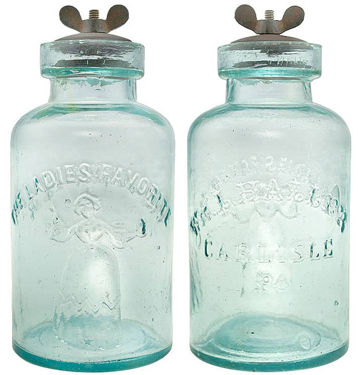
Embossed woman on “LADIES FAVORITE” fruit jar. What is amazing with this photograph is the color of the bottle in the ladies hand. – North American Glass

Embossed sun on OBERMEYER & LIEBMANN – On November 27th 1854, a German immigrant named Samuel Liebmann purchased a brewery in Williamsburg which would become the greatest brewery in New York over the course of the next 100 years. In 1868 he retired, and in 1872 he passed away, leaving the business to his three sons, Joseph, Henry, and Charles. It is unclear which of the sons branched off to create the S. Liebmann’s Sons Brewing Co. The company was successful until 1905, when it was passed down to their grandsons. To this day, no one is sure where the name Obermeyer comes from in the companies history. – Mikes Bottle Room

Embossed motif oval with cabin in woods (Sutters Mill) CHALMER’S CATAWBA WINE BITTERS, Chalmers bought the Alhoff Vineyard. Spruance & Stanley were proprietors of the bitters 1872-1873 when vineyard discontinued growing Catawba grapes. – Forbes Collection

The codd in the middle is a Redfearn Bros manufactured bottle and the difference in the quality of the embossing compared to the other two ‘Kiner Bros’ bottles is very evident, the Redfearn bottle having a lion with a full detailed mane whilst the others just have a crude circle for it’s head! – Francis Romanowski

Embossed Indian on Antique Coppahaunk Ginger Ale Embossed Soda Bottle from Waverly, Virginia.- eBay

Posted in Spirits, Water, Whiskey | Tagged , , , , , , , , , , , , , , , , , , , , , , , , , , | 1 Comment

JD Willoughby NY Fruit Jar, Bottle “The Ladies Favorite”

JD Willoughby NY Fruit Jar, Bottle “The Ladies Favorite”

27 August 2012

Apple-Touch-IconADid anyone happen to see the “The Ladies Favorite” fruit jar that closed on eBay today? I love that name. Reminds me of the People’s Favorite Bitters (Read: Barrel Series – Favorite Bitters & Peoples Favorite Bitters. The pictures on eBay were rather poor. Last time I looked it was around $3,500. Description as follows:

Hello All, Here we have the rarest of Fruit Jars, I have not been able to find even ONE example of this jar. This is not the more common WM. Haller variety. Perhaps it was the one used to display JD Willoughby’s invention the patented stopple they designed. It is in great condition with lots of whittling and a dark aqua color it is 6 & 5/8ths inches tall with a 2 inch opening it appears to be a pontil top with very thin glass where it was blown into a mold 2 very small chips less than 1/16 of an inch in the very top of the jar which is in a part that is taller than the the rest of the top “see picture”. Great rare find I am sure this is a record breaker. No cracks. Two small white spots inside the glass one in the bottom the other above the L in Willoughby. Do not miss this one it is great!!!!!!!!!!!!! putnamantiquesexchange

(eBay pictures below)

(Below) Did see that Greg Spurgeon with North American Glass had sold a killer similar example in the past. The description and pictures are below.

Wm Haller Carlisle Pa THE LADIES FAVORITE
A fine example in shiny mint condition. Comes with the rare original cast iron 2-inch Willoughby stopple. This quart is one of the most appealing fruit jars created in the 19th century. The best possible example. – North American Glass

(Below) Pictorial LADIES FAVORITE Wm HALLER Jar
This jar has a repair to the mouth, but what a wonderful & appealing rarity! There is nothing else wrong with the jar….has good embossing, and shiny, whittly, crude glass. This unique example was apparently made for a cork closure, an unlisted closure variant. As opposed to the usual Willoughby stopple finish, the jar was finished with a thin-walled mouth. The repair takes in about 1/3 of the mouth finish. With the lip repair, you can own this example for a fraction of the usual cost. – North American Glass

LadiesFavorite_GW96

“THE LADIES FAVORITE” / (woman in full dress holding a jar) – “WM. L. HALLER / CARLISLE / PA.”, (SFJR #511), Pennsylvania, ca. 1860 – 1870, bluish aqua quart, smooth base, applied mouth, original ‘J.D. Willoughby Patented January 4, 1859’ two piece iron disk closure and wing nut

Posted in Auction News, eBay, Fruit Jars | Tagged , , , , , , , , , | Leave a comment

Rick Ciralli – Comedic Genius Bottle Guy

Jerry Lewis

Rick Ciralli – Comedic Genius Bottle Guy

26 August 2012

Apple-Touch-IconAThe Urban Dictionary describes Comedic Genius as “the most intensely, legit, bad-ass on the planet; a comedic genius misunderstood in his era”. In the antique bottle and glass world, where our passion rules, there are numerous characters that I have had the pleasure of meeting. This is without a doubt. It is when you mentally line up the bottle people you know, what they collect and how the interact with others, that you start noticing that some people, more than others, really jump out.

In 2003, my first year with tables at the great Baltimore Antique Bottle Show, there was this fellow behind Elizabeth and myself that chattered, smiled, joked, knew every body and was wheeling and dealing more than anything we had ever seen at any type of show. I even bought a yellow Halls Bitters that was really nice from the ‘talkin and jokin salesman’.

Hey…I got my table back….

Well next year he was not at the table. Turns out that he didn’t send his renewing contract in on time and with the Baltimore Club, you do that, you lose your spot, and boy was his table in a premier location near the entry doors to the massive show. My wife said to me, where is that real talkative guy? We actually missed him! We found him later in a back area of the cavernous room wheeling and dealing and cavorting around as usual. It was then, that we realized that this guy was a player. He somehow got another table though he could have gone to the back of the waiting list for dealers to get tables at the sold out show. Of course by now, you know I am talking about the good looking, charming, humorous, wheeler and dealer, family man and authority of early American glass, Rick Ciralli from Bristol, Connecticut.

My facebook post asking “is this a Colombian importer and his Chica Bonita?”. Rick followed up with the Chippendale jab prompting this post.

I pick on Rick here because of his recent comment to an earlier picture of us (see above) on facebook where he said something about a Chippendale Dancer which made me smile; but…..I thought, how can I get him back….

Mugging for the camera. Interesting that he usually has this face when pondering a question about Connecticut glass.

Here are some fun pictures of Rick. It should remind us that it is not only the great bottles and glass, the history and the stories that we cherish, this is also about the people that populate our wonderful glass world. We all know this. Make no mistake, Rick is a great guy. You will not meet a finer comedic dude that can switch hats at a moments notice to be one of the most knowledgeable glass guys I know.

Rather normal attire when Rick gives a Connecticut glass talk

“Who believes in this reincarnation junk anyway?” – Brian Wolff

Rick says…My wife caught me kissing a sunburst flask…That’s me sleeping under the tarp.

Not too many people can still look good eating.

Daughter mimicking father or father mimicking daughter?

Ricks cultured side. Unfortunately he was the only person at this ‘tasting’ event which does present another question.

A friend of everyone, Rick with Charles Flint

Rick’s response when we were looking for some ways to stop eBay fraud. Rick wanting to put one of his New Jersey contacts on the job.

awwl….Rick & Vicki

Hangin with my baby

Some time ago, topless juggling 2 eggs at once…amazing even to this day

Posted in Bottle Shows, Collectors & Collections, Early American Glass, Facebook, Humor - Lighter Side | Tagged , , , , , , , , | 1 Comment

FOHBC Bottles and Extras in the mailbox Monday!

With record speed and great teamwork from the Bottles and Extras Editorial Team,(Martin Van Zant, Bill Baab, Alan DeMaison, Randy Selenak, Dave Maryo, Gene Bradberry & Ferdinand Meyer V) I am pleased to announce that we were able to assemble a great September | October 2012 issue that is being finished and bound at the printer this weekend. This was a challenge based on the Reno Expo date and an impending publishing deadline. We did not want the Reno Expo articles in the November | December issue. Here are a few teaser opening spreads to get you fired up!

The FOHBC membership is up dramatically of late with close to 100 new members signed up at Reno and since. PLEASE become a member of the FOHBC. We are stronger as a group.

Bottles and Extras

Vol. 23 No. 5 | September – October 2012 | No. 203

Features: The California Perfume Company – Part 1 Russell L. Mills 10 Feature: Reno Expo 2012 Ferdinand Meyer V 18 Recent Auction Results Norman Heckler & Co. 36 Reno: The FOHBC Banquet Ferdinand Meyer V 38 Reno: The Shootout Pam Selenak 42 Reno: The Expo Displays and Displayers Bob Ferraro 48 Henry’s Bottling Works in What Cheer, Iowa Bill Baab 57 Reno: By Rail or Bust Alan DeMaison 58

Vignettes: Shards of Wisdom 4 In Remembrance 6

Departments: FOHBC Business & News | FOHBC Officer Listing 2012-2014 2 President’s Message Classified Ads & Ad Rate Info 64 FOHBC Show-Biz, Show Calendar Listings 66 Membership Directory 70 Membership Application 72

Just a few of the great articles you will see in the next issue of Bottles and Extras!

Reno Expo Feature Article

The FOHBC Banquet Article

Displays and Displayers Article

Shootout Article

Reno by Rail or Bust Article

The California Perfume Company – Part 1

Posted in Advice, Article Publications, Bottle Shows, Bottles and Extras, Club News, FOHBC News, News, Publications | Tagged , , , , | Leave a comment

Could this be a Texaco Gasoline Bottle?

Incoming question about a bottle.

Thank you for the kind reply. Here are some pics of the Water Jug. Thick green, lots of bubbles, mold marks and striations and a nice deep Olive Green. It’s approx 18 and a half inches by 11 inches. Has wear, and looks like it has age, not a newer piece in my option. I tried to take a pic of what I think says “Texaco” on the bottem but it is very faint. The person I bought it from said it might have been a Gasoline Jug. I really appreciate this. Thank you again, Nick.

From my friend and Texas bottle authority Brad Seigler:

I have looked at that texaco jug til my eyes crossed. If it is embossed Texaco, it is a great item. Even trying to resesrch for a Texaco item comes up empty. Either way I think it is great.

Comments from facebook:

Marianne Dow: “I would bet it says Mexico.”

Rick DeMarsh: “I am with Marianne as the top is not allowable for even very old kerosene bottles IE for stoves…drip style and with something that size full would be hefty and in any kind of enviorment garage or home the base wear would be pretty heavy i’m thinking. Just my opinion”

Michael Dolcini: “I can remember getting gas in one gallon jugs with handle.”

[Wikipedia] Texaco (“The Texas Company”) is the name of an American oil retail brand. Its flagship product is its fuel “Texaco with Techron”. It also owns the Havoline motor oil brand.
Texaco was an independent company until it merged into Chevron Corporation in 2001. It began as the Texas Fuel Company, founded in 1901 in Beaumont, Texas, by Joseph S. Cullinan, Thomas J. Donoghue, Walter Benona Sharp, and Arnold Schlaet upon the discovery of oil at Spindletop. For many years, Texaco was the only company selling gasoline under the same brand name in all 50 US states, as well as Canada, making it the most truly national brand among its competitors. Its current logo features a white star in a red circle (a reference to the lone star of Texas), leading to the long-running advertising jingles “You can trust your car to the man who wears the star” and “Star of the American Road.” The company was headquartered in Harrison, New York, near White Plains, prior to the merger with Chevron.

Texaco Founding through 1930s

1901 – Founded in Beaumont, Texas. Known as the Texas Fuel Company.

1905 – Texaco establishes an operation in Antwerp, Belgium, under the name Continental Petroleum Company.

1913 – Texaco acquires control of the Central Petroleum Company.

1914 – Occupied new offices in Houston on the corner of San Jacinto and Rusk.

1928 – Texaco becomes the first U.S. oil company to sell its gasoline nationwide under one single brand name in all 48 states (50 states after Alaska and Hawaii joined the Union in 1959).

1931 – The Texas Company (Texaco’s corporate name) purchases Indian Oil Company, based in Illinois, a move that expands Texaco’s refining and marketing base in the Midwest and also gives Texaco the rights to Indian’s manufacturing processes of Havoline “Wax Free” motor oil, which becomes a Texaco product and provides the company with a higher-quality motor oil product.

1932 – Texaco introduces Fire Chief gasoline nationwide, a motor fuel that meets the octane requirements for fire engines, and promotes it through a radio program over NBC hosted by Ed Wynn, the “Texaco Fire Chief.”

1936 – Texaco begins supplying the Nationalist rebels in Spain with oil, and continues to do so for the duration of the war, delivering some 3,500,000 barrels.

1936 – Marketing operations east of Suez (including Asia, East Africa, and Australasia) are placed into a joint venture with Standard Oil Company of California – Socal (Chevron) under the brand name Caltex, in exchange for Socal placing its Bahrain refinery and Arabian oilfields into the venture.

1937 – Texaco commissions industrial designer Walter Dorwin Teague to develop a modern service station design. The resulting “Teague” Texaco station design is a functional white building with green trimmings featuring one or more service bays for “Washing”, “Marfak Lubrication”, etc., an office area with large plate glass window for display of tires, batteries, and accessories, along with “Men” and “Ladies” restrooms featuring Texaco-green tile walls and floors. The Teague station design is typically built of white porcelain tile but local and regional variations could include painted brick, concrete brick, and stucco materials. Other features include red Texaco stars on the upper facade on outer sidewalls and above the service bays, and red lettering spelling out “TEXACO” above the office area. Stations are identified by the street from Texaco’s “banjo” sign.

1938 – Texaco introduces Sky Chief gasoline, a premium grade fuel developed from the ground up as a high-octane gasoline rather than just an ethylized regular product. Sky Chief is dispensed from a silver gas pump in contrast with the red pump used for Fire Chief gasoline – a move that lasts many years until the early 1960s. 1939 Texaco tanker truck by Dodge on display at the Henry Ford Museum.

1939 – Texaco becomes one of the first oil companies to introduce a “Registered Rest Room” program to ensure that restroom facilities at all Texaco stations nationwide maintained a standard level of cleanliness to the motoring public. The “Registered Rest Room” program is later copied by other oil companies and continued at Texaco until the energy crises of the 1970s, which was caused by oil embargoes.

The old-style Texaco gas stations, the ones that were painted white with forest-green streamline stripes and a free-standing post bearing the red Texaco star logo on a white disk, were designed by Walter Dorwin Teague (also known for designing the Kodak Brownie camera and a host of other streamlined artifacts). In his book “Design This Day” (1940) Teague shows his original work for Texaco, the exhibition hall he designed for them at the Texas Centennial fair in 1935, plus photos of the small gas stations which were built cookie-cutter-like all over America.

Texaco Gas Filling Station – rusty 1930’s Dodge tow truck, vintage Texaco sign and an old gas pump. Near Wheatland in NW Oregon – flickr

Beautifully engraved certificate from the Texaco Oil Company issued from 1974 – 1978. This historic document was printed by the American Banknote Company and has an ornate border around it with a vignette of oil derricks, factories, and a seaport with a ship next to the dock. This item has the printed signatures of the Companyís President and Secretary.

Vintage Texaco Oil Bottles

Texaco oil salesman sample bottles with carrying/display case, good condition, very small chip on bottom of one bottle (barely noticable). Each bottle has a different oil sample and label: heavy, extra-heavy, medium, light, and “winner”. Three bottles posses original corks, two without. Each contains original oil samples

Posted in History, Questions, Technology, Utility Bottles | Tagged , , , , , , , , , , , , , , | Leave a comment

Hentz’s Curative Bitters – Unlisted Variant Found

HENTZ’S CURATIVE BITTERS without the expected embossed “PHILADELPHIA”

Hentz’s Curative Bitters – Unlisted Variant Found

23 August 2012 (R•040919)

Apple-Touch-IconAIncoming email and pictures from Bill Ham, author of Bitters Bottles and Bitters Bottles Supplement.

Ferdinand: Here is an unlisted variant of the HENTZ’S CURATIVE BITTERS. It looks like H 88 but doesn’t have PHILADELPHIA embossed.

Bill received the following communication in a previous email:

“Does NOT have any town; only HENTZ’S /CURATIVE BITTERS [on 2 indented panels]. Watson says the color is lime [I call it pale green] and I bought it for a scarce bottle & paid dearly for it, because of it’s clarity & shelf/display appeal. The deceased owner paid in his log $75 for it way back in 1968 and that was pretty big money. I want $300 for it & will send pics to any interested collector as I’m not a bittersman but like minty glass stuff.”

The Carlyn Ring and W.C. Ham original listing in Bitters Bottles is as follows:

H 88  Hentz’s  Curative Bitters Philadelphia
HENTZ’S // CURATIVE / BITTERS // PHILADELPHIA // f //
9 5/8 x 2 3/4 (7 3/8) 3/8
Square, Aqua and Clear, LTCR, Tooled lip, 3 sp, Scarce

The new listing by Bill Ham for the forthcoming Bitters Bottles Supplement 2:

H 88.5  Hentz’s  Curative Bitters
HENTZ’S // CURATIVE / BITTERS // f // f // b // x
9 x 2 1/2
Square, Aqua, LTC, Applied mouth, 2 sp, Extremely rare
Two sides have embossing peened out

Which Hentz are we talking about?

Looking online, I found the following information for two different Hentz’s which is puzzling. Maybe one of you have some more definitive information so we can confirm which Hentz marketed and sold the HENTZ’S CURATIVE BITTERS.

Henry J. Hentz and Percy Hentz listed with White, Hentz & Co. in Philadelphia. William A. Hentz & Co. also listed in Philadelphia Directory.

WILLIAM A. HENTZ
Philadelphia, PA.
1871-1893

Succeeded by Wm. Wilkinson (Boyd’s). A letterhead from 1885 shows the company to be Wm. A. Hentz and Wm. C. Wilkinson, Importers and wholesale dealers in wines and liquors. Manufacturers of and wholesale depot for Scheetz’s Celebrated Bitter Cordial. Agents for Jules Mumm & Co. Champagnes.

Percy Hentz, son and partner of the firm’s founder must have had a falling out with Wilkinson. He set up next door and claimed to be “The only HENTZ on 3rd St”.
Mida shows the “Stylus Club Pure Rye Whiskey” trademark used since 1/1/1891.

Stylus Club Pure Rye Whiskey paper weight

The company used the brand names: “Stylus Club”, and “W. H. & Co. Rye Est. 1793.”

Business name timeline: William A Hentz (1871-1877), William A Hentz & Co (1878-1893) then became Wm Wilkinson..

Address timeline: 258 N 3 rd (1871-1877), 139 N 3 rd (1878-1893)

Stylus Club Pure Rye Whiskey advertisement

I also found the following listing for another Hentz in Philadelphia:

WHITE, HENTZ & CO.
Philadelphia, PA.
1793-1918

Est. 1793., 1907 letterhead shows J. Henry Hentz Jr. and Wm. R. W. Hentz as proprietors (J = Jacob). 1884 letterheads cite J. Henry Hentz & J. P. Robinett. Represented in NY by D. Lieber, 17 S William Street. Importers and wholesale dealers in wines & liquors.

The business was established in 1793 by Philip Wager. In 1810 it became Van Syckel & Garrison and following the retirement of Mr. Garrison, Van Sykel & Sons. In 1849, Wm. R White and J. Henry Hentz formed the partnership. The name stayed but by 1895, J. Henry Hentz and J. Henry Hentz Jr. were the partners. Hentz senior was born in Philadelphia and traveled extensively in Europe. His son joined the business after graduating from the University of Pennsylvania and became a partner in 1885. Trimble Whiskey was introduced around 1830. The business grew to have branches in New York (at the above address) and also in Washington DC, first at 1200 Pennsylvania Ave (ca. 1892), later in the Glover Building, 1419 F Street, N.W. (1895). The Philadelphia base “extended back to Bread Street, a distance of 200 feet, the receiving and shipping being done in the rear”. 224 2nd St was erected in 1793 and then 222 in 1860. (includes a photo). Mida has the “WHCo – Estbd -1793” in use since 1884. The first electric sign in NY Times square advertised Trimble Whiskey.

The company used the brand names: “Monogram Pennsylvania Rye”, “Pennsylvania Monogram Rye”, “Trimble”, “W. H. & Co.”, and “White Hentz & Co..”

Business name timeline: White, Hentz & Co.

Address timeline: 222-224 N 2nd (1870-1918)

Philadelphia and Popular Philadelphians

HENTZ’S CURATIVE BITTERS without the expected embossed “PHILADELPHIA”

HENTZ’S CURATIVE BITTERS without the expected embossed “PHILADELPHIA”

HENTZ’S CURATIVE BITTERS without the expected embossed “PHILADELPHIA”

HENTZ’S CURATIVE BITTERS (H 88) with embossed ‘PHILADELPHIA’ – Meyer Collection

H 89  HENTZ’S CURATIVE BITTERS (Sample)
FREE SAMPLE / HENTZ’S CURATIVE / BITTERS // f // f // f //
4 1/4 x 1 1/2 (2 7/8) 1/4
Square, Aqua, LTCR, Scarce

Sample size HENTZ’S CURATIVE BITTERS (H 89) – Meyer Collection

Posted in Advertising, Bitters, Collectors & Collections, Digging and Finding, History, Questions, Whiskey | Tagged , , , , , , , , , , , , , , | Leave a comment

Photographs and Images of People Drinking – Part III

Photographs and Images of People Drinking – Part III

PART III of a Series – Ketcham Drinking Gallery

23 August 2012

Apple-Touch-IconAWith record speed I am opening the third gallery of vintage drinking pictures from up North as new material has come in from Steve Ketcham. This is a continuation of Photographs of People Drinking – Part I and Photographs and Images of People DrinkingPart II. If you have any candidates for inclusion in future galleries, please forward. Thanks.

Steve Ketcham accepting an award at the FOHBC Reno Expo Banquet

Hi Ferdinand, I have been busy scanning my bottle-related photos, and will send along more in the near future. For now, I felt it imperative to send along these images of groups of young gents drinking because methinks it only proper that the young ladies in the Phi-Drinka-Dogma image you posted be accompanied as they drink. It appears that one fellow, standing in front of John Woratschka’s Saloon (New Ulm, Minnesota), was doing a bit of cross-dressing. Oh, the folly to which drinking may lead! Thanks for all the Peachridge Glass fun! Steve Ketcham

Visit Steve’s great web site Antique Bottle Depot

Ketcham Drinking Gallery

The bottles all carry Grain Belt (Minneapolis Brewing Company) labels.

Look at the size of the pot-bellied stove and the whiskey bottles. No getting cold here!

Equally spaced spittoons at the long bar.

Not a frown among them. Three in the group appear to be holding enameled cups bearing the image of the Kaiser.

Diggin’ those boots the guy on the right is wearing.

Wife helping out. Like that risque nude picture behind her. No Playboy yet.

That fellow up front appears to be a bit underage!

They are drinking Hamm’s Beer, a St. Paul, Minnesota product.

Enjoying a Grain Belt (Minneapolis Brewing Company).

I like all the hanging towels on these bar pictures. Wipe that spittle and froth away.

Washburn, Wisconsin pose. What are they drinking?

The stenciled jug at right is from Wm. Steinmeyer, a Milwaukee liquor dealer.

Judging from the labels and signs, this one was in St. Paul.

Lots of spittoons here.

Local NRA meeting? (not meant to offend NRA members – I took my rifle safety training from this organization at a very young age!)

Posing in front of a Milwaukee bar

Lots of missed shots at the spittoons.

Notice the Lash’s Bitters sign at upper left.

The dog on the bar is in charge of filling growlers.

Two views of a Minneapolis bar.

A group seeking to stay warm in the snows around New Ulm, Minnesota.

Schmidt’s Beer get prominent space above this pose.

A Milwaukee saloon gathering.

Not as early as the other photos, but a fun photo of what appears to be a post WWII St. Paul or Minneapolis bar.

Strange as it may seem, I have the three decanters just to the right of the lady behind the bar in my collection: Minnesota Club, Old Blue Ribbon, and Pickwick Rye. Those last two brands were sold by George Benz of Appetine bitters fame. Labeled bottles of several other local brands can be identified here as well. – Steve Ketcham

Note the glass label decanters on the bar.

St. Paul, Minnesota bar pose. Got to be winter time.

Looks like the Fourth of July.

A serious game of Old Maid? Young gents from Chippewa Falls, Wisconsin

Both proud and toasting their new haircuts.

Four young gents with a Pike’s Peak Flask – photo provided by Mark Vuono

Photographs of People Drinking – Part I

Photographs and Images of People Drinking – Part II

Photographs and Images of People Drinking – Part III

Photographs and Images of People Drinking – Part IV (Brewing)

Photographs and Images of People Drinking – Part V

Photographs and Images of People Drinking – Part VI

Possibly the Earliest Photograph of People Drinking Beer – Part VII

Posted in Advertising, Ales & Ciders, Breweriana, History, Humor - Lighter Side, Photography, Spirits, Tobacco, Whiskey | Tagged , , , , , , , , , , , , , , , , , , , , , , , , , , , , , , , | 2 Comments

Aqua Dr. Jacobs Bitters New Haven, CT – Pontil & Full Label

DR. JACOB’S BITTERS – eBay

Aqua Dr. Jacobs Bitters New Haven, CT – Pontil & Full Label

22 August 2012 (R•110614)

Apple-Touch-IconAI like this listing on eBay for the smaller, DR. JACOB’S BITTERS (J 11) for a number of reasons. It seems to be a fresh, found bottle, it has a really nice label and the embossing is pushing into the label making some profound statements with the eye appeal of the bottle. I have captured a few of the pictures, added the eBay listing, noted the Carlyn Ring and W.C. Ham listings in Bitters Bottles and added two examples from my collection. This is a great, aqua bitters bottle with some good history from New Haven, Connecticut.

“found in 2007 in a house, clean out here in central CT and recently remembered by the crew & acquired by us this weekend”

eBay description (CTMH1):

Aqua Dr Jacobs Bitters New Haven, CT, Pontil & Full Label, approximately 3″ x 1 3/4″ x 8 3/8″, medium aqua in color, applied slopping top, heavily whittled, impressive tubular pontil, embossed on 3 sides “DR JACOB’S BITTERS / S. A. SPENCER / NEW HAVEN, CT”, complete with ORIGINAL full label, reads in part “DR. JACOBS / COMPOUND / WILD CHERRY / SARSAPARILLA / GOLDEN SEAL / & MANDRAKE BITTERS….. S A SPENCER Sole prop….of the ORIGINAL Recipe and prepared only at SPENCER & CLARK ……….opposite / RAILWAY STATION NEW HAVEN CONN …..”, see photo, retains what probably is the original cork, some dried contents in the corners of the bottom, bottle is attic mint, retains 90% of the original label, some staining & aging, see photo but is darker than the photos, found in 2007 in a house clean out here in central CT and recently remembered by the crew & acquired by us this weekend.

DR. JACOB’S BITTERS – eBay ( I like this ‘grid’ assemblage arranged by the seller)

Embossing pushing into the label creating really cool visual effects on the DR. JACOB’S BITTERS – eBay

This creative Heineken billboard reminds me of the Dr. Jacobs embossing pushing thru the labels above.

The Carlyn Ring and W.C. Ham listing in Bitters Bottles is as follows:

J 10  DR. JACOB’S BITTERS, Circa 1862 – 1875
DR JACOB’S / BITTERS // NEW HAVEN, CT. // f // S. A. SPENCER. //
L…Dr. Jacob’s Compound Wild Cherry Sarsaparilla Golden Seal & Mandrake Bitters
10 1/4 x 4 x 2 1/2 (7 3/8) 1/2
Rectangular, Aqua, LTC, Applied mouth, With and without rough pontil mark,
Scarce
Label: S. A. Spencer, Sole Proprietor of the original recipe and prepared only by Spencer & Clark at their Medicine Depot opposite the Railway Station, New Haven, Conn. Prepared from the roots and barks of our fields and woods. For liver complaints and all forms of bilious diseases. For scrofula, erysypelas, and every variety of scrofulous affections, impaired digestion, loss of appetite, general nervous debility, constipation of the bowels, headache, acid stomach, and all those complaints arising from and depending upon impure blood or a foul stomach.

The taller, DR. JACOB’S BITTERS (J 10) – Meyer Collection

DR. JACOB’S BITTERS (J 10) – Meyer Collection

Jacobs011_GWA115

“DR. JACOB’S / BITTERS, – S.A. SPENCER. – NEW HAVEN, CT.”, (Ring/Ham, J-10), Connecticut, ca. 1855 – 1865, bluish aqua, 10 1/4”h, smooth base, applied tapered collar mouth. Paul Hadley Collection. Perfect condition, highly whittled glass, an exceptional example! Ex. Dan Murphy Collection #106. – Glass Works Auctions

J 11  DR. JACOB’S BITTERS, Circa 1840 – 1860
DR. JACOB’S / BITTERS // NEW HAVEN, CT // f // S. A. SPENCER //
8 1/2 x 3 x 1 3/4 (5 1/2) 5/16
Rectangular, Aqua, LTC, Applied mouth, With and without rough pontil mark,
Common

The smaller, DR. JACOB’S BITTERS (J 11) – Meyer Collection

DR. JACOB’S BITTERS advertisement in the Corning (NY) Journal – Thursday, April 3, 1862

Posted in Bitters, Collectors & Collections, eBay, Medicines & Cures, Sarsaparilla | Tagged , , , , , , , , | Leave a comment

Looking at Labeled Carter’s Cone Inks

It seems like a good time to switch gears and look at some conical inkwells. There has been a lull in the action since the flurry of posts earlier this year on small inks. Starting off today, I was inspired by an incoming email from Gene Ainsworth II:

Hope this won’t underwhelm anyone too much but this could be a contender for “finest example” of a Carter’s cone ink (if there is such a thing). All kidding aside, this is a hard to find color for a cone and the great label (see above) makes it a top notch example. Look for it on eBay soon. Gene

Let’s look at what we have on cone inks:

Some of the earliest ‘cone’ inkwells. It is generally accepted that the brown glazed bottles contained black or blue ink and the white, red ink. The first bottle (two-tone) is the smallest of three known sizes. [AntiqueBottles.co.za]

Ink was first used about 2500 BC in Ancient Egypt and China. The modern day digger and collector soon came to realise that our Victorian forebearers spent most of their time either drinking, cleaning house or writing letters…this observation is based on what one might find on a typical “dig”. [AntiqueBottles.co.za]

Color group of ringed cone inkwells – [sha.org]

Ink bottles tend to be named after items which they closely resemble i.e cone, umbrella, turtle, teakettle, igloo, boat, tent, barrel, cottage, pyramid…etc. Where the shape is not characteristic then the names of the manufacturers are used for identification i.e Carter, Temple, Pridge, Field, Hyde, Blackwood, Derby, Hollidge…etc. [reference: AntiqueBottles.co.za]

As a general statement, ink bottles (and inkwells) were designed for stability while being used to fill a pen or dip a quill. To quote Munsey (1970), “…because (pens and quills) must be dipped into the ink container frequently during writing, ink bottles were designed to minimize tipping.” Although there is no universally accepted size cut-off point, generally speaking the majority of ink bottles hold 3 or 4 ounces of ink or less, typically about 2 ounces. Anything above 3 or 4 ounces should probably be considered a bulk or master ink – [sha.org]

Amber ringed cone ink – [sha.org]

The conical ink style appears to have first originated in the Unites States during the 1830’s and are typically called simply “cones” or “cone inks” by collectors (Covill 1971). Glass makers called this plain style (i.e., with no horizontal ring/rings at the shoulder) the “plain cone” style (Whitney Glass Works 1904). These particular cone ink bottles are typically blow-pipe or “open” pontil scarred, have a rolled finish, typically about 2.3″ to 2.5″ tall and 2.5″ in diameter, were blown in a true two-piece “hinge” mold with no air venting, and are attributed to Portland druggist Nathan Wood (druggists often bottled ink in the 19th century and before) who was in business from at least as early as 1851 until at least the late 1880’s; Nathan died in 1887 though his son continued the drug business after that time (McKearin & Wilson 1978; Faulkner 2009). These particular cone shaped ink bottles were also made in shades of amber and olive green glass and date from the earlier years of the business, i.e., 1850’s to early 1860’s. [sha.org]

The subject of today’s post, William Carter began his ink business in 1858 on Water St. in Boston. Two years later he was joined by his brother Brother Edward in Carter & Bro. In 1861, John H. Carter entered the firm which changed to William Carter & Bros. The earliest bottles known are pontiled and smooth base umbrellas ink bottles bearing their label. [BottleBooks.com] [Read more on the Carter’s Ink Company at PRG]

A few examples of labeled Carter’s cone inks are pictured below along with a few other brands with labels. The last three pictures in the post are earlier plain cone and shouldered cone inks.

Read More on Carter’s Inks: Hinks Inks – Post 3 “Carter’s Ink Company”

Read More on Carter’s Inks: Spectacular Labeled Carter Cathedral Ink Grouping

Partially labeled Carter’s cone ink in a deep green aqua

Labeled CARTER’S GREEN HOUSEHOLD INK in a ringed cone form

Circa 1910-1920 Mr. & Mrs. Carter’s Inx Ink advertising card blotter. The card shows the classic Carter’s Inx figural china bottles. This card has the imprint of the “Cumberland Valley State Normal School, Shippensburg, Pa.” The card measures 6″ long by 3 1/2″ tall.

Early Carter’s Ink advertisement – BottleBooks.com

Fully labeled CONTINENTAL JETBLACK INK in a ringed cone form – Hinkel Collection

Fully labeled BRILLIANT RED INK made by Thaddeus Davids & Co, New York in a ringed cone form – Hinkel Collection

Two fully labeled DOVELL’S Writing Fluid Inks in a ringed cone form – Hinkel Collection

Labeled THADDEUS DAVIDS & CO’s Writing Fluid in a ringed cone form – Hinkel Collection

Spectacular, bubbly, open-pontil, plain cone ink – John April

Earlier plain cone ink in a gorgeous blue

Two shouldered cone inks

Posted in Collectors & Collections, eBay, History, Inks | Tagged , , , , , , , , , , , , , , , , , , , , | Leave a comment

“Damn the torpedoes, full speed ahead!”

“Damn the torpedoes, full speed ahead!”

21 August 2012

PARIS HORTON KEACHBALTIMORE

Apple-Touch-IconAIt is very gratifying and exciting when I start down a path and doors start opening. Yesterday I saw a gorgeous picture of Keach soda water bottles from Baltimore in a color run on facebook (Fig:1) that I quickly surmised as being torpedoes in form. You will also sometimes hear the term Ten-pin to describe the shape.

Fig: 1 Paris Horton Keach 1845-47 torpedoes. My color run is coming along nicely. Would really like an olive colored example or an aqua one – Chris Rowell

Torpedoes make me think of the phrase “Damn the torpedoes, full speed ahead!” This leads me on a quick search to brush-up on my history of Admiral Farragut who I believe the phrase is attributed to. I also seem to remember a United States postage stamp (Fig:2)  from my stamp collecting days. Looking good so far; bottles, color run, history, postage stamps, Baltimore (my home town) etc. All the right ingredients!

Fig: 2 U.S. Postage stamp, David Farragut, Issue of 1903, 1-dollar. black, U.S. Government, Department of the Post Office

I then circle back to Chris Rowell, the Baltimore digger and collector that posted the Keach torpedo picture. It seems like whenever I see a great torpedo soda, I think of Chris who specializes in this area (Fig:3). Visit Chris Rowell’s web site: Antique Bottles of Baltimore.  Read more on Chris at PRG:

Some Early Hostetter’s Stomach Bitters Shards Dug by Chris Rowell,

E & S FREY, BALTIMORE Druggist’s Label Restoration by Chris Rowell

The Washington Monument Bottle – Baltimore

Fig: 3 Good beer after a hard day of digging. Chris Rowell with beer in hand.

Well, let’s put a lasso around all this torpedo talk and get started. I really do not know that much about any of the various soda brand names that are embossed on torpedoes other than just recognizing a few of the popular Baltimore names (Fig:4) such as Keach, Boyd, Cole, Coughlan. Gardner & Brown and Russell. You can see examples on Chris’s web site.

Fig: 4 Other brand names in Baltimore Torpedo Sodas – Rowell Collection

First, a quick search confirms my memory and leads me to a wonderful illustration of Rear Admiral David G. Farragut found in Harpers Weekly (Fig:5). A definition from Wikipedia confirms the phrase is from the Battle of Mobile Bay in 1854 and attributed to the Admiral.

Fig: 5 Rear-Admiral David G. Farragut, U.S.N. illustrated in Harper’s Weekly, Saturday, August 29, 1863

[Wikipedia] David Glasgow Farragut (July 5, 1801 – August 14, 1870) was a flag officer of the United States Navy during the American Civil War. He was the first rear admiral, vice admiral, and admiral in the United States Navy. He is remembered in popular culture for his order at the Battle of Mobile Bay, usually paraphrased: “Damn the torpedoes, full speed ahead!” by U.S. Navy tradition.

Fig: 6 Battle of Mobile Bay – Bataille de la baie de Mobile par Louis Prang (1824-1909)

The Battle of Mobile Bay (fig:6) of August 5, 1864, was an engagement of the American Civil War in which a Federal fleet commanded by Rear Adm. David G. Farragut, assisted by a contingent of soldiers, attacked a smaller Confederate fleet led by Adm. Franklin Buchanan and three forts that guarded the entrance to Mobile Bay. The battle was marked by Farragut’s seemingly rash but successful run through a minefield that had just claimed one of his ironclad monitors, enabling his fleet to get beyond the range of the shore-based guns. This was followed by a reduction of the Confederate fleet to a single vessel, ironclad CSS Tennessee. Tennessee did not then retire, but engaged the entire Northern fleet. The armor on Tennessee gave her an advantage that enabled her to inflict more injury than she received, but she could not overcome the imbalance in numbers.

Fig: 7 60-lb. charge and 100-lb. charge Mushroom Anchor Torpedoes used by rebel Confederates in the seige of Mobile, Alabama

So now that I have torpedoes wrapped up in my mind, I start thinking of why these bottles are called torpedoes (Fig:7). Actually, I have always wondered why someone would even make a bottle in this shape which would be so hard to ship and sit upright on a table or bar. The torpedo pictured above is not the sleek, thin torpedo we think of from World War II movies but instead a bulbous, fat cigar shape very similar to the soda bottles. It is almost like the bottle designer was inspired by torpedoes! They were made early I understand. Here is some basic information that I could find on Keach in Baltimore.

[from Chris Rowell – Antique Bottles of Baltimore] I don’t have exact dates for when Keach was in business but I would say early 1840’s-1848. This is one of the more available Baltimore torpedoes and in my opinion this is not because Keach was in business for a long time but because Keach went out of business very suddenly leaving many empty bottles in the hands of consumers so many of those bottles ended up in attics, basements, and privies because there was no one to return them to. I know of only one Keach mold it is very distinct in that Keach is embossed high up on the torpedo and very close to one of the seams of the bottle rather than being centered like the other Baltimore torpedoes. This bottle also comes in a wide variety of colors including apple green, yellow green, deep emerald green, olive green, yellow topaz, and apricot puce. They are only found with a smooth base with a sharp tapered lip.

[Wil Martindale – the Bottle Den] Another early one, Paul (or Paris?) Keach went to a yellow green torpedo probably around 1845 through 1847 when he suddenly dropped out and his mold was used to create the RUSSELL torpedo (around 1847). The vast majority of whole KEACH’s are yellow green in color, and all known examples are in torpedo form.

These exotic yellows, deep clarets, topaz and apricot puces, I believe, pre-date 1845 and were blown right alongside SUTTON’S open pontiled deep puce soda, some looking from the same batch of glass, maybe a little later than the open pontiled deep claret lager it is next to in a couple pics (RANDALL era, late 30′s). I believe they finished these torpedos in a clamp between 1840 and 1845 at Federal Hill, whereas the open pontiled RANDALL (and a few other super rare open pontiled ones) pre-date 1841.

[from North American Soda and Beer Bottles] Something different happened in Baltimore. Whereas the Roussel style bottle was the norm in the rest of the country, in Baltimore some of the early producers used the Roussel style at first, and then shifted to the English style of torpedo or ten pin shaped bottles. In fact during the period 1845 to 1850, all of the soda bottles used by Baltimore merchants (with the exception of the extremely rare Cole & Co and Cole & Chickering sided sodas) were of the English style. There are at least two possible reasons for this: first, Baltimore was a port city where imported English style bottles were probably in most establishments. These could have been reused by some bottlers who may have had their own bottles made in the same style for constant filling and packaging. Second, this style of bottle was used by Randall & Company and John Lee Chapman, who were fashionable producers. Randall & Company were in the famous Barnum’s Hotel and Chapman operated a well known soda water shop and drug store. Perhaps this style of bottle represented a higher class of product. Whatever the reason, collectors can be thankful for these beautifully shaped and variously colored bottles.

It seems that more Baltimore bottles of these forms were dug in California than in Baltimore!

About 1851 Peter Babb moved his mineral water establishment from Philadelphia to Baltimore, and successfully reintroduced the soda shaped bottle to the Baltimore market. Soon all of the Baltimore firms were phasing out the torpedo and ten pin shaped bottles and using the soda shaped bottles. William Russell and William Coughlan are examples of this shifting of styles. But what to do with all of the old style torpedo and ten pin shaped bottles? Many were filled with soda and mineral waters, packed on ships and sent to the gold fields of California. It seems that more Baltimore bottles of these forms were dug in California than in Baltimore!

[from North American Soda and Beer BottlesRandall & Company was a partnership that was made up of Dudley A. Randall and Paris Horton Keach. Both men were born in Rhode Island, but their lives were to follow different paths. Randall was born about 1806 and in 1826 we find that he was living in Providence, Rhode Island as a member of a fire company. Eliza Fenner and Dudley A. Randall were wed in Providence by Rev. Pickering on Oct. 28, 1829. By 1828, Randall is listed as a grocer. Grocers in New England often engaged in the brewing of small beers like mead and root beer. It appears that Randall learned this trade and became proficient enough in brewing, that he relocated to Baltimore between 1832 and 1835 and set up a mead manufactory at 126 Howard Street. He claimed that he had been in this occupation for 11 years in 1844, which may place him in Baltimore in 1833 or perhaps he was brewing in Providence starting in that year.

Keach was born about 1816. Keach married Eliza Niebling on November 21, 1843 at the First English Lutheran Church in Baltimore. It is possible that Keach was related in some way to Randall, but in any case the two were partners in Randall & Company starting as early as 1839.

KEACH BALT

Three KEACH BALT bottles in drop-dead gorgeous colors – Rowell collection

Apricot puce KEACH BALT Torpedo Soda Water – American Bottle Auctions (Sold for $8,000 without auction house premium) *a similar example in a holder sold for $17,920 (see top of this post for image)

Green KEACH BALT Torpedo Soda Water – American Bottle Auctions (Sold for $1,300 without auction house premium)

Apricot KEACH with BALT on reverse – American Bottle Auctions | Auction 53

KEACH BALT in brilliant yellowish green, highly whittled, thousands of bubbles – GreatAntiqueBottles.com

Detail of above, KEACH BALT in brilliant yellowish green, highly whittled, thousands of bubbles – GreatAntiqueBottles.com

Posted in Auction News, Civil War, Collectors & Collections, Color Runs, Digging and Finding, Figural Bottles, History, Postage, Questions, Soda Water | Tagged , , , , , , , , , | 1 Comment