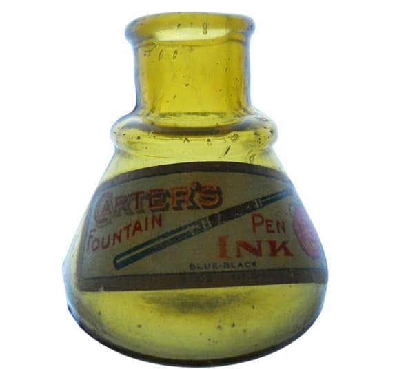
It seems like a good time to switch gears and look at some conical inkwells. There has been a lull in the action since the flurry of posts earlier this year on small inks. Starting off today, I was inspired by an incoming email from Gene Ainsworth II:
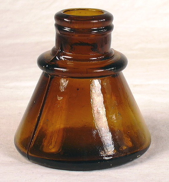
Hope this won’t underwhelm anyone too much but this could be a contender for “finest example” of a Carter’s cone ink (if there is such a thing). All kidding aside, this is a hard to find color for a cone and the great label (see above) makes it a top notch example. Look for it on eBay soon. Gene
Let’s look at what we have on cone inks:

Some of the earliest ‘cone’ inkwells. It is generally accepted that the brown glazed bottles contained black or blue ink and the white, red ink. The first bottle (two-tone) is the smallest of three known sizes. [AntiqueBottles.co.za]
Ink was first used about 2500 BC in Ancient Egypt and China. The modern day digger and collector soon came to realise that our Victorian forebearers spent most of their time either drinking, cleaning house or writing letters…this observation is based on what one might find on a typical “dig”. [
AntiqueBottles.co.za]

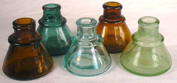
Color group of ringed cone inkwells – [sha.org]
Ink bottles tend to be named after items which they closely resemble i.e cone, umbrella, turtle, teakettle, igloo, boat, tent, barrel, cottage, pyramid…etc. Where the shape is not characteristic then the names of the manufacturers are used for identification i.e Carter, Temple, Pridge, Field, Hyde, Blackwood, Derby, Hollidge…etc. [reference:
AntiqueBottles.co.za]
As a general statement, ink bottles (and inkwells) were designed for stability while being used to fill a pen or dip a quill. To quote Munsey (1970), “…because (pens and quills) must be dipped into the ink container frequently during writing, ink bottles were designed to minimize tipping.” Although there is no universally accepted size cut-off point, generally speaking the majority of ink bottles hold 3 or 4 ounces of ink or less, typically about 2 ounces. Anything above 3 or 4 ounces should probably be considered a bulk or master ink – [sha.org]
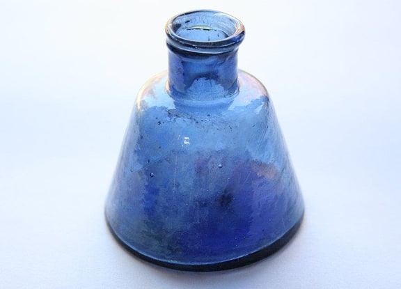
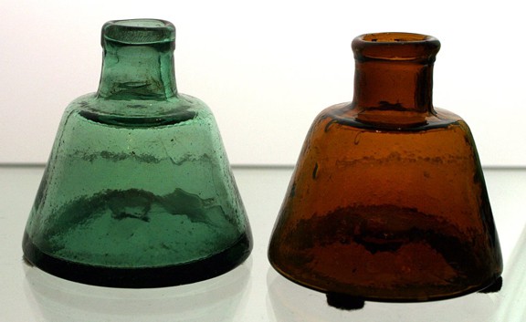
The conical ink style appears to have first originated in the Unites States during the 1830’s and are typically called simply “cones” or “cone inks” by collectors (Covill 1971). Glass makers called this plain style (i.e., with no horizontal ring/rings at the shoulder) the “plain cone” style (Whitney Glass Works 1904). These particular cone ink bottles are typically blow-pipe or “open” pontil scarred, have a rolled finish, typically about 2.3″ to 2.5″ tall and 2.5″ in diameter, were blown in a true two-piece “hinge” mold with no air venting, and are attributed to Portland druggist Nathan Wood (druggists often bottled ink in the 19th century and before) who was in business from at least as early as 1851 until at least the late 1880’s; Nathan died in 1887 though his son continued the drug business after that time (McKearin & Wilson 1978; Faulkner 2009). These particular cone shaped ink bottles were also made in shades of amber and olive green glass and date from the earlier years of the business, i.e., 1850’s to early 1860’s. [
sha.org]
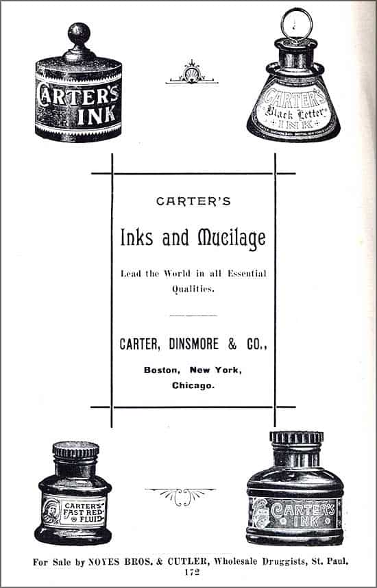
The subject of today’s post, William Carter began his ink business in 1858 on Water St. in Boston. Two years later he was joined by his brother Brother Edward in Carter & Bro. In 1861, John H. Carter entered the firm which changed to William Carter & Bros. The earliest bottles known are pontiled and smooth base umbrellas ink bottles bearing their label. [BottleBooks.com] [Read more on the Carter’s Ink Company at PRG]
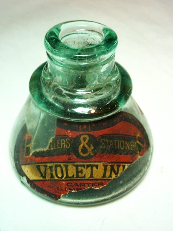
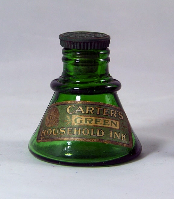
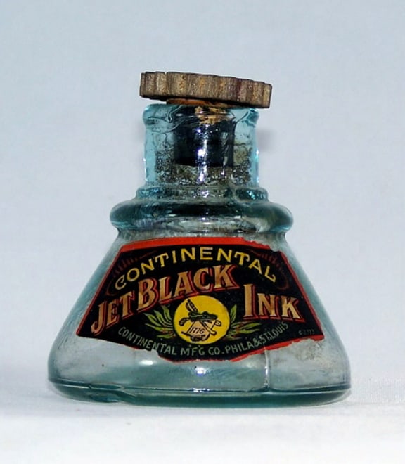
A few examples of labeled Carter’s cone inks are pictured below along with a few other brands with labels. The last three pictures in the post are earlier plain cone and shouldered cone inks.
Read More on Carter’s Inks: Hinks Inks – Post 3 “Carter’s Ink Company”
Read More on Carter’s Inks: Spectacular Labeled Carter Cathedral Ink Grouping

Partially labeled Carter’s cone ink in a deep green aqua

Labeled CARTER’S GREEN HOUSEHOLD INK in a ringed cone form

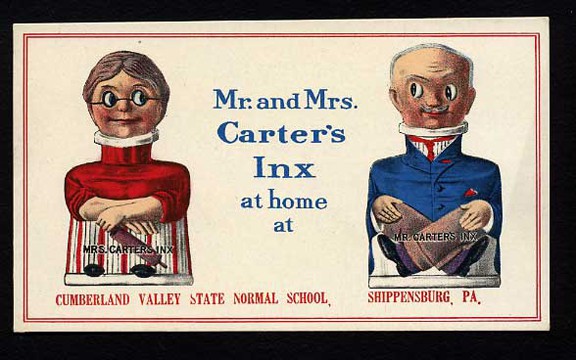
Circa 1910-1920 Mr. & Mrs. Carter’s Inx Ink advertising card blotter. The card shows the classic Carter’s Inx figural china bottles. This card has the imprint of the “Cumberland Valley State Normal School, Shippensburg, Pa.” The card measures 6″ long by 3 1/2″ tall.

Fully labeled CONTINENTAL JETBLACK INK in a ringed cone form – Hinkel Collection

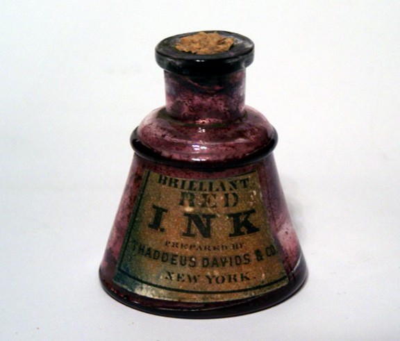
Fully labeled BRILLIANT RED INK made by Thaddeus Davids & Co, New York in a ringed cone form – Hinkel Collection

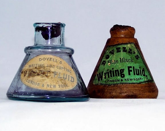
Two fully labeled DOVELL’S Writing Fluid Inks in a ringed cone form – Hinkel Collection

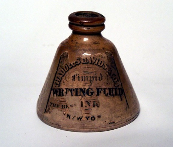
Labeled THADDEUS DAVIDS & CO’s Writing Fluid in a ringed cone form – Hinkel Collection

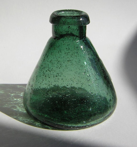
Spectacular, bubbly, open-pontil, plain cone ink – John April

Earlier plain cone ink in a gorgeous blue

Two shouldered cone inks
About Ferdinand Meyer V
Ferdinand Meyer V is a native of Baltimore, Maryland and has a BFA in Fine Art and Graphic Design from the Kansas City Art Institute and School of Design. Ferdinand is the founding Principal of FMG Design, Inc., a nationally recognized design consultation firm. Ferdinand is a passionate collector of American historical glass, specializing in bitters bottles, color runs, and related classic figural bottles. Ferdinand is married to Elizabeth Jane Meyer and lives in Houston, Texas, with their daughter and three wonderful grandchildren. The Meyers are also very involved in gardening (Peachridge Gardens), antiques (Peachridge Collections), and early United States postage stamps. Ferdinand is the past three-term president of the Federation of Historical Bottle Collectors, a long-time board member, FOHBC 2021 Hall of Fame, and one of the founding members of the FOHBC Virtual Museum.

