B O T T L E C O L O R S

“There is no reference guide a collector can use to denote color to a fellow collector in advertisements or in conversation.”
Hello Ferdinand,
First of all let me introduce myself. My name is Shawn McAlister. I started in bottles in the early 80’s. My first show was the Las Vegas expo in the mid 80’s. I was blown away and hooked. I joined the Los Angeles Historical Bottle Club. Eventually becoming treasure, program organizer, vice president and president. I, like you have found bottles to be one of my passions. I fell out of collecting because of a divorce. About 3 years ago I reengaged in the hobby and rekindled my friendships in the hobby. Like you I share that the friendships in this hobby make it great. I am by no means a major player, but I collect what I can have built a collection that I enjoy and hope to continue add to my collection.
One of the things I noticed back in the 80’s and it is still a problem today in my assessment. There is no reference guide a collector can use to denote color to a fellow collector in advertisements or in conversation. I think it would be great if the Federation would take up the charter to publish an official color guide that could be referenced by auction houses, collectors, and magazines. It does not matter what the color is named in the listing if we could just use it as a reference for the bottles color in natural light. In the 80’s I was trying to think of a method using thin transparent acetate colored strips that could be used to blend to provide the color of an item to another collector. Now with the internet the color schematic can be on-line and brought up to view. I don’t know how many conversations I have had over Emerald Green! It would be great to have this chart on the computer because it would allow for several layers of color gradients. We might even get away with naming the color and use number or letter gradients of the base colors used in descriptions. We have all been dismayed by a description that did not match our interpretation of the color.
It’s just a thought I wanted to share. I do not know if this is something feasible, but most collectors I have talked to have totally agreed with the concept and agree it is a needed tool. Appreciate your time.
Respectfully,
Shawn McAlister
Shawn:
Nice to hear from you you. Creating a color guide is certainly a goal of mine and I hope to make it a goal of the FOHBC. In a recent interview, posted earlier in the week by American Bottle Auctions, I even snuck it in to a paragraph of goals for the hobby and Federation. Read: An Interview with Ferdinand Meyer-The New Face of the Hobby
“The key is the Federation of Historical Bottle Collectors. We are stronger as a whole. We can do more as a group such as promote our Code of Ethics, have great National shows, promote regional and local shows thus increasing attendance, document our history, have a virtual museum, a bricks and mortar museum, develop collector and auction house standards for grading and colors, have interactive forums and web sites, a great magazine, newsletter, influence legislature and understanding of our hobby and digging, culture the next generation, and have special events like our banquet, seminars, shootouts etc. that rarely happen elsewhere. The sum of the parts is much greater than any one of us so increasing membership is critical. We are up dramatically in FOHBC membership this past year and I attribute this to the machinery being oiled and moving at a faster and regular pace than it has been in years past. I frequently hear that Bottles and Extras, our bi-monthly, 72-page color magazine is what you get when you join the FOHBC. Well true, you do. The magazine is just the icing on the cake to me. I tell people that you get to be meet and belong to a group of the greatest and most passionate group of people on earth, who love antique bottles and glass.”
Would you mind if I used your email, which was wonderfully worded to jump start a post on this topic? I may even include it in the “Letters to the Editor’ portion of Bottles and Extras. Thanks. Let’s stay in touch.
Ferdinand
Read More: Glass Passion and Color Part II : Exploration and Color
 Roscolux Theatrical Gel Fan Book
Well…Wouldn’t it be nice to have a pocket fan book of transparent gels that were grouped, labeled and grommeted so that you could view or overlay swatches and identify bottle and glass colors in a uniform way? Entirely possible. We are almost halfway there with theatrical gel books now such as the Roscolux fan pictured above. Of course, most of us are also aware of paint swatch guides, printer ink guides and cloth swatches to help us understand and specify color.
Why don’t we discuss this long nagging prospect further. Before I hear from you, and I would like to hear your ideas, I thought I would list a few random comments and challenges from myself and others to clear the deck, so to speak. I would also like you to check out what Greg Spurgeon has to say about this with fruit jars over at North American Glass. He seems to be the most organized along with Reggie Lynch over at AntiqueBottles.com.

My vote for my all-time favorite bottle color description from an auction house – Heckler (2011)
The Nature of Glass
Glass, in most cases, is a transparent material. To see colors in glass, we need a source of visible light passing thru the object and meeting our eyes. In the absence of light, there’d be no visible color. The type of light (whether natural, incandescent, fluorescent, or other), its orientation (front, back, top, bottom, side, combination), and the brightness of the light source will further determine the appearance of colors at the moment of viewing. Positioning of the glassware item makes a difference, since a jar or bottle placed on a display shelf against a solid white wall, will appear darker and more richly colored than the same jar displayed with back lighting, or placed in a sunny window. For a glassware item sitting on a wall shelf, the brightness behind the item is reduced by the item’s proximity to the wall…..that is, we’re looking thru the object and into its shadow. The same bottle or jar, when moved away from the wall, placed in a window, or held to a light, seems lighter-colored in appearance. [North American Glass]

Color Guide from North American Glass (Greg Spurgeon)
Color Naming
Color naming is an important subject for collectors of antique glassware, but can be a source of confusion…especially for those newly entering the hobby. Many reference books identify bottles & jars, their values, makers, etc….but few, if any, have attempted to fully describe color terminology. [North American Glass]
Color Blindness
There is a significant portion of our population that have some degree of color blindness. This includes approximately 8% of men and 0.5% of women. Color blindness or color vision deficiency is the inability or decreased ability to see color, or perceive color differences, under normal lighting conditions. Read: New Outlook on Colorblindness
Perception of Colors as we Age
As we age, there is an increased chance that we will have difficulties in perceiving color. With cataracts, colors fade or seem more yellowish. Some of the elderly have trouble identifying the color yellow.
Natural Light vs Illuminated
Bottles and glass look different in sunlight vs illuminated from a man-made light source.
Sunlight
Bottles and glass looks different in direct sunlight, vs indirect sunlight vs back illuminated sunlight such as a bottle in a window.
Illumination
Front illuminating a bottle will look different than back-illumination such as in a light cabinet. Incandescent lights will look different than fluorescent or LED.
Regional
One might get romantic and say ‘sea mist’ for a bottle color in New England and ‘sage’ in the desert southwest.
Position
A bottle color may look different or change depending on the influence of an adjacent bottle.
Shadows & Reflections
A bottle shadow or reflection can influence a bottle color.
Equipment
Calibration of computer screens, printing presses and image projectors so that we are all looking at the same image.
Chameleon
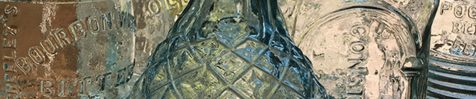
There are bottles that seem to change colors like a smokey puce Bourbon Whiskey Bitters.
Prejustice
A movement is underfoot to discredit ‘brown’ bottles. I have written on this lately. Read: Not Brown – A “chocolate” Brown’s Celebrated Indian Herb Bitters and Not Brown – Old Amber “Harvey’s Prairie Bitters”.
Unification
Bottle collectors vs. insulator collectors vs. glassware vs. jars, vs marbles etc may each have their own color names and classes.
E X I S T I N G C O L O R G U I D E S

Sea Glass color reference chart

SHADES OF AMBER
The color name “Amber” derives from the gemstone, which is basically a fossilized tree sap. Amber is an orangish-brown color used to describe glass color with many adjectives added. Lighter amber colored jars and bottles are sometimes improperly called “yellow”. The simple visual test we use for discerning true yellow, is that it has none of the orange tint of amber. Look for noticeable amber (orange) tones in the thicker parts of the glass such as the base and lip areas. Here we depict a few true yellow jars (Globes) alongside some of the many shades of amber. – North American Glass (Greg Spurgeon)

Came across this rather well done chart of insulator colors. Make sure you follow the link to All Colors Insulator Gallery and click on each insulator. – Glassian.org

Antique Bottle Colors – AntiqueBottles.com
T H E C O L O R A M B E R

The color Amber art from previous Peachridge Glass posts.


there is a jar color guide, which is quite broad, it seems that color is different to different people, and tends to fudge things up…
Ferdinand,
This is a great subject to expound on. A standardized color term for antique glass that is universally accepted is long, long overdue. I’ve had numerous conversations with fellow collectors on this subject. Personally my preference would be to use a recognized color terminology for descriptions instead of numerical or alphabetical usage, such as color 134 or AC65. I hope the FOHBC does take on such a monumental task, it certainly would be useful.
Seeing the Roscolux fan book, I have to offer a resounding Yes! Having worked in concert/venue lighting in the past I can understand the benefits that a standard such as this would provide. While the company that I had worked for used Lee filters exclusively rather than Rosco, I can still recall (25+ years later) what the numbers are for the most popular colors that we used. A numbered system has merit. Terminologies alone leave the door open to interpretation but when combined with a number it is specific. Is it lavender or is it congo blue 181. My 2 cents
Sorely needed., especially since the adjectives we use are all over the board, bringing different colors to mind for different people. Examples are olive-yellow, yellow-olive; citron green, yellow-green. Or how about gasoline, salmon, sunset and copper-puce.
Seems to me that 10-15 yrs. ago someone had already done the preliminary footwork, including coming up with a binder of color transparency swatches. Anybody else recall? Will have to dig thru old bottle mags.
I recall seeing something like that more recently, in the last 5 years. Lighting gels were used for the color swaths…
Yes, froggy, I recall that attempt about 10-15 years ago; do you recall why it didn’t go anywhere?
Sounds like no one is aware of the Spec-Tru transparent color slide system that has been used by some in the insulator and jar collecting community for at least 15 years plus? Here’s the home page: http://cmtk3.webring.org/l/rd?ring=insulators;id=4;url=http%3A%2F%2Fwww%2Espec%2Dtru%2Ecom%2F
Thanks. Was not aware of the Spec-Tru system. Very interesting and informative. Thanks Dwayne. Does your group use this method often? Has it been accepted? Pros & cons?
Recalling my observations at the time the system was developed and released, it was greatly heralded as a huge step forward in solving the color issue that has plagued many glass collecting hobbies. However, two problems ensued: (1) Not everyone was willing to purchase the color slide system, creating a gridlock for those that did. Calling out color slide numbers to collectors that were not accepting of the system was like speaking a foreign language to them, therefore you were forced to revert back to using color name descriptors. (2) It can be somewhat time consuming to sit with a packet of slides and find a color-match, especially when it can take multiple combinations of slides to zero in on a specific color. Unfortunately, we have become a society demanding immediate results, with no time to fiddle with a brain-teasing arrangement of hues and shades that must be combined to create the desired color.
I purchased a Spec-Tru shortly after their initial release and it still sits here in my bookcase. I have used it maybe three times in 15+ years. It is now rare to see anyone using the system. It’s a shame, because it really was/is a brilliant idea and provides good results for those willing to commit to the practice of using it.
The only arguable drawback for me with this system, or any other I’ve seen, involves the fact that bottles, jars, insulators and the like, are observed through two layers of glass, that is, when we view them we are seeing light transfer through the front, back and sides of the object, giving it a heightened color density. When viewing a single layer of the same glass object, the color shade is lighter and can appear quite different. Trying to match dual layers of glass with a single layer color slide system can be tricky.