
Not Brown – Old Amber “Harvey’s Prairie Bitters”
10 October 2012 (R•052714) (R•061017) (R•111020)
 There is a movement underfoot to discourage the celebration and collection of brown bottles and glass. I know of major collectors discouraging this color and others removing ‘brown’ bottles from their collection. They are promoting the greens, yellows, and blue ranges which are, without a doubt, ‘prettier’ and more pleasing to the eye.

I am not one of those collectors. I simply do not use the description ‘Brown’ in describing the color of a bottle. I use the term ‘Amber’ as a starting point and break it further into dark amber, light amber, golden amber, yellow amber, red amber, tobacco amber, old amber, auburn, bronze, cedar, chestnut, chocolate, cinnamon, cocoa, copper, ginger, hazel, khaki, mahogany, oak, ocher, puce, reddish, root beer, russet, rust, saddle brown, sandy, sepia, umber, wheat, earthen, caramel, sienna, muddy, topaz, bistre, almond, henna, etc.

In celebration of the color amber, I start a new series on historical bottles in amber coloration. In this first post, I look at Old Amber.
O L D A M B E R

The Prairie Is My Garden by Harvey Dunn
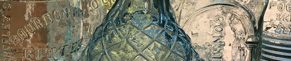
HARVEY’S PRAIRIE BITTERS

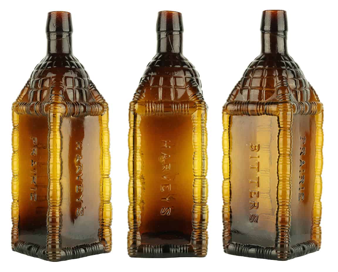
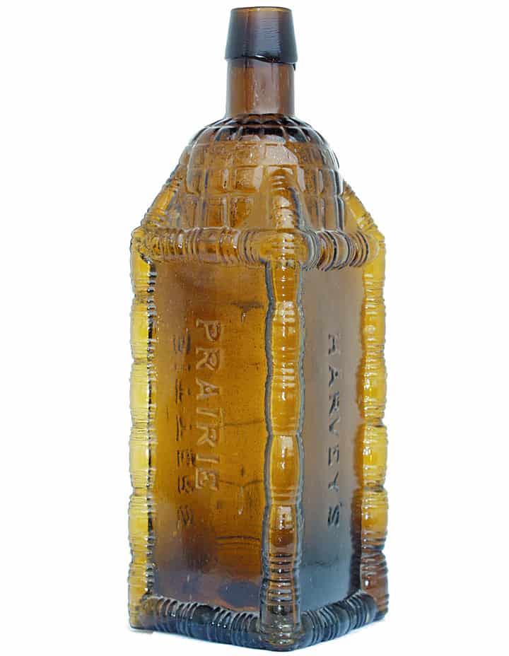
H 67 HARVEY’S PRAIRIE BITTERS
HARVEY’S // PRAIRIE // BITTERS // f // // s // patterned // PATENTED // patterned // patterned //
9 1/2 x 3 1/4 (6)
Square, Amber, LTC, Applied mouth, Very rare
From Indiana Chicago, March & Harvey, 12 State, 1865 Chicago, Illinois City Directory
Squier T. Harvey and Christian G. March
(Top 10 most desirable bottles)
Harvey’s Prairie Bitters – Meyer Collection
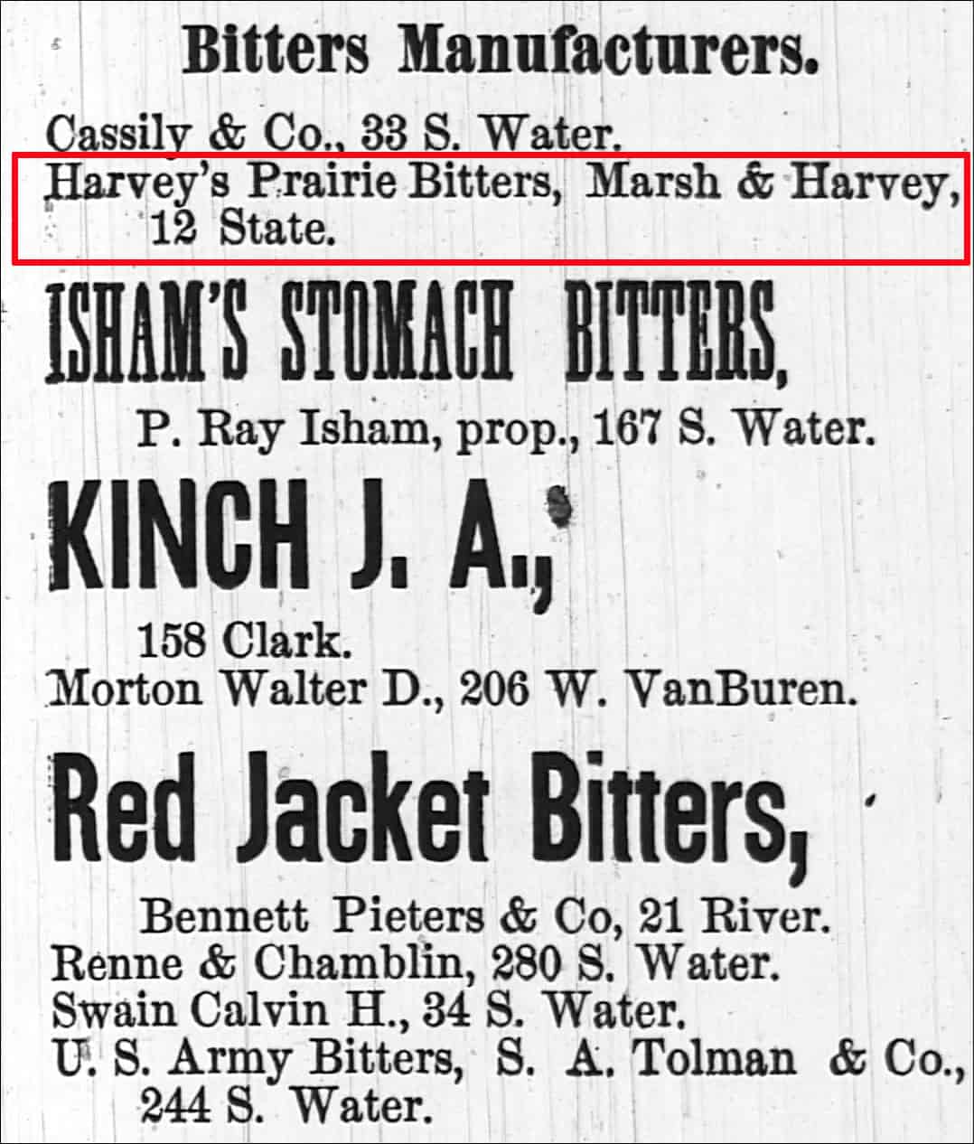
Advertisement for Harvey’s Prairie Bitters, Marsh & Harvey, 12 State, Chicago City Directory
Very crude with a number of seed bubbles and a pronounced body twist.

HARVEY’S PRAIRIE BITTERS – Shades beautifully from deep color base, shoulder and neck areas to a considerably lighter center and even lighter corners. Very crude with a number of seed bubbles and a pronounced body twist. Ex: Judge Blaske and Dr. Burton Spiller Collections. Same bottle pictured in ‘The Encyclopedia of Collectibles’, page 141 – Meyer Collection

HARVEY’S PRAIRIE BITTERS – Shades beautifully from deep color base, shoulder and neck areas to a considerably lighter center and even lighter corners. Very crude with a number of seed bubbles and a pronounced body twist. Ex: Judge Blaske and Dr. Burton Spiller Collections. Same bottle pictured in ‘The Encyclopedia of Collectibles’, page 141 – Meyer Collection
Harvey’s Prairie Bitters – Bitters Bottles Supplement


As possibly the most prevalent color seen in the bitters category of bottle collecting I find that if examples are not included in collections, the other colors such as aqua, greens and blues tend to not stand out near as much. Having contrast between shades of brown (amber) and greens, blues, etc. makes one really appreciate the other colors that bitters are found in.
I’m with you on the AMBER thing and Warren makes good points too. One of my favorite colors is ORANGE-amber, a rather distinctive shade, sometimes in a rich & gorgeous”burnt- orange” tone. I find that, while some ambers can be rather drab and lifeless, most come alive with BACK LIGHTING. Obviously character improves the appearance of amber bottles so-displayed.