
The bottles I ordered from Dogriver came today
14 June 2013
Hi Ferd,
The bottles I ordered from Dog River Glass came today. I have enclosed a few photos. Let me share my thoughts on this group.
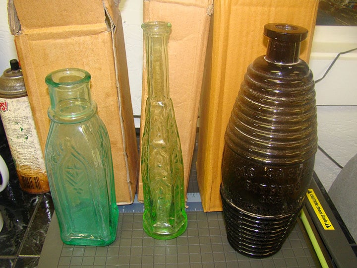
The small pickle bottle is not as nice as the bottles he made years ago. Or should I say he sold years ago. The bottle has a thick base in the corner on one side which is common on repro bottles. It is smooth base and the bottle is stained which makes it look older. It is not square and is a bit lop sided. It is a little under blown. Most collectors who have been around would think it was a fake in my mind.
The pepper sauce bottle is an interesting bottle. It feels slippery to the touch. It also is a smooth base bottle. Top is like some bottles I have seen that are old. It is blown more fully in the mold. The base has been ground to make it stand even. The glass has a look like the uranium bottles that clevenger made years ago. I can not find my black light but it sure looks like it would glow. Most collectors who have been around would think it looked funny to be old.
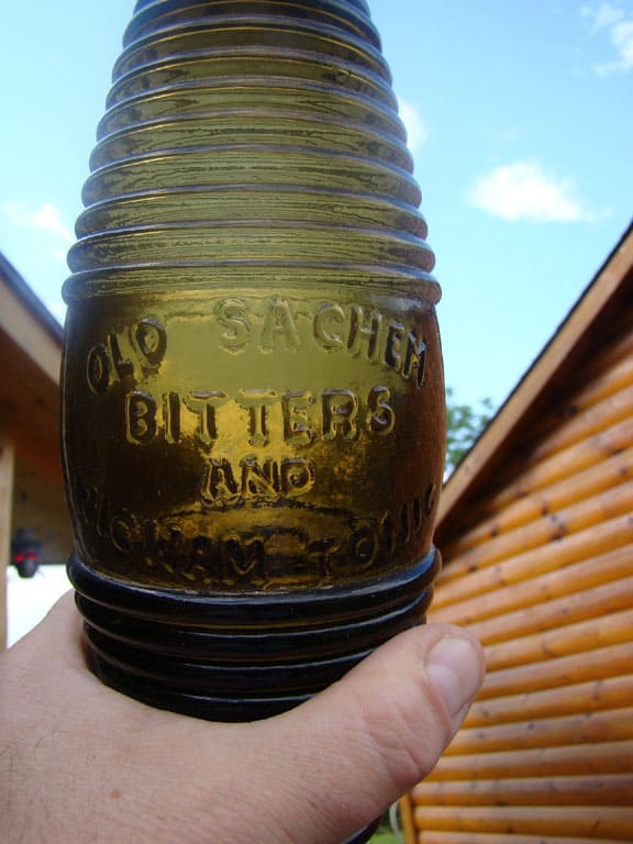
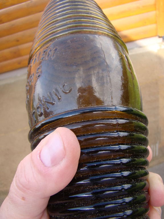
The barrel bitters is a bottle that truly worries me. I have collected bottles for over 35 years and collected bitters about 25 years ago. If I ran into this bottle at a flea market I would think it was old. It is one of the best repro bottles I have ever seen. It is a olive green type color. Embossing looks good (I don’t have a real one to compare it to). The applied top is done well. It has some grime on it like it needs to be washed. There are shallow bubbles like old barrels have. The only thing that looks at all funny is the top of the lip. It looks a bit polished or something. Most barrels have alot of lines and mold marks in the lips. There is no way the average collector would think this is a fake if they had not heard about these being made. I guess the major bitters collectors may spot something wrong. To me this is as good as it gets. Clevenger made some killer Booze Bottles back in the 1930’s and this bottle is at that level. Please note the boxes they came in. They look like recycled cardboard and are like alot of boxes that things are shipped in from off-shore countrys. Buyers beware.
Jim Bender
Note: Jim Bender is the FOHBC Membership Director and is a passionate collector of Union Clasped Hands historical flasks. Jim also has a couple hundred reproduction bottles that he has collected over the years and is an authority on the topic. Thank you Jim for staying on top of this.
Read: Drake’s Plantation Bitters and other Reproductions out in the market
Read: More on Reproductions from Jim Bender and Bruce Silva


I’m looking at the embossing and comparing it to the real ones I have and I can see some obvious differences. The “D”, in old, looks crooked and poorly formed. The “S”, in Sachem is short on the bottom edge. The “T” s, in Bitters, look very sloppy and not well formed as in the originals. It also looks like the words, Wigwam and Tonic are very close the the bottom set of rings. My originals have a wider gap than it looks like in your photo, about 1/4 of an inch from the bottom of the “T” to the top of the ring. Anybody else see any other differences? Thanks for keeping us posted! Marty p.s. I wish I could see one in person. Where could I get my hands on one?