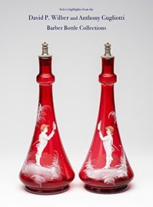
Glass Passion and Color Part II : Exploration and Color
09 April 2011
*as reprinted from The Federation of Historical Bottle Collectors (FOHBC) Bottles & Extra Magazine. November-December 2009.
Download PDF: Article_2

Spread 1 – Exploration & Documentation

Spread 2 – Exploration & Documentation

Spread 3 – Exploration & Documentation

Bottles and Extras November-December 2009
Glass Passion and Color Part II: Exploration and Documentation by Ferdinand Meyer V
In Part I, within the last September/October Bottles and Extras issue, I discussed my history and passion in pursuing Early American Historical Antique Bottles. This article is devoted to the actions that occur once I obtain a targeted bottle. What color is it? Was the description correct? Are there any issues? How do I inspect the bottle? Where will it be placed? How will it be photographed?
What history, provenance and added information can I get regarding the bottle? What collateral material is available such as trade cards, advertising, bill heads and go withs and finally, how will the bottle be stored electronically for insurance, documentation and reference. All of these questions beg for answers. I’m not sure why I do all this, but one thing is for certain, this procedure keeps me grounded and intimate with my glass. This process allows a comprehensive 360 degree, high level of participation that keeps me focused and in a position to learn. It is much more than just a bottle.
Color is the most obvious property of a glass object. It can also be one of the most interesting and beautiful properties. Although color rarely defines the usefulness of a glass object it almost always defines its desirability.
The earliest glass workers had no control over color. The first bottles derived their color from impurities that were present when the glass was formed. ‘Black bottle glass’ was a dark brown or green glass, first produced in 17th century England. This glass was dark due to the effects of the iron impurities in the sand used to make the glass and the sulfur from the smoke of the burning coal used to melt the glass. Many of my favorite early figural bottles have this type of dark green coloration.
Then, through accident and experimentation, glass makers learned that adding certain substances to the glass melt would produce spectacular colors in the finished product.
The recipe for producing colored glass usually involves the addition of a metal to the glass. This is often accomplished by adding some powdered oxide, sulfide or other compound of that metal to the glass while it is molten. The table to the left lists some of the coloring agents of glass and the colors that they produce.
Manganese dioxide and sodium nitrate are also listed within the glass color chart. They are decoloring agents or materials that neutralize the coloring impact of impurities in the glass. Sometimes it is necessary to remove these unwanted colors caused by the impurities to make clear glass or to prepare it for coloring. The decolorizers are used to precipitate out iron and sulfur compounds. There is an abundance of information on the Internet regarding glass color and I recommend you visit the Web site of Historic Glass Bottle Identification & Information, www.sha.org/bottle/colors put together by the Bureau of Land Management (BLM) and the Society of Historical Archeology (SHA). Greg Spurgeon has also done a rather nice job and created an Antique Fruit Jar Color Guide on his North American Glass web www.gregspurgeon.com.
Of course color is my first interest, but as a Bitters collector first, I possess many very rare clear and aqua bottles that I have decided to display in one room. Surprisingly, this room has a great feel and the aqua glass is stunning when natural light penetrates the room and highlights the bottles. We affectionately call this the Ice Room.
Bottle grading is a particular interest of mine. As noted in my previous article, I have other collecting interests and enjoy antiques, old toys, stamps and other collectibles. A number of these hobbies including coins, baseball cards and comic books etc. have rather sophisticated grading systems. I suspect that this is going to generate much posi ive and negative discussion but I think it is high time that we, collectively as a group, figure out a way to get away from, my pet peeve, the terms Perfect, Near Perfect and About Perfect as one leading Auction house uses (I am guilty myself sometimes).
Another respectable Auction house uses Fine, Very Fine and Extremely Fine to describe bottles. Now a third Auction house has broken away and is using a point system where a rating of 100 is, I would assume, virtually perfect. Who is right or wrong? Hard to say. All the Auction houses have been around a long time and seem to be doing well. Problem is, we are all using a fluid and highly subjective grading system that varies with the locale, economy and type of bottle. I realize beauty is in the eye of the beholder, but some type of uniform ground rules are needed.
I have to admit, I like what Jeff Wichmann is doing at American Bottle Auctions with the streaming videos, voice-overs, studio photography, numerical ratings and very detailed descriptions for his auctions. This is headed in the right direction. To be fair, I have read and heard some negative comments about this grading system using numbers but you are not going to please everybody. It seemed to get the point across when I was in school and was being graded. Keeping this in mind, a rating of 92 would make my parents happier over a grade of 89. Minor point spread but sometimes the difference between getting a A- or a B+ grade. Surprised some Auction house out there is not using this type of scholastic grading system!
I understand that ideally, nothing will beat visiting and looking at the bottles prior to the subject auction but for myself, this is rarely possible due to my work schedule and being located in Texas. I was able to visit ABA and look at the Bryan Grapentine collection for a few hours, but realistically, I could have spent a few days there if I wanted to be as thorough as I should have been. We live in this virtual world and can truly, for better or worse, be a collector and not leave our own house.
Hopefully when a new and updated FOHBC web site is operational, we can have an open forum on this topic and work through some of these issues. I am committed to seeing this happen as I know others are too. There is a remarkable web site called Western Bitters News, www.westernbittersnews.com. These guys are really pushing ahead and posting a great deal of information and generating discussion on a daily basis on some tough topics. Change is good but rarely easy. We all need to work together to better the cause of our hobby.
Another area of concern is Bottle Provenance and the genuineness of the bottle I see and contemplate adding to my collection. I mean, has the bottle been tampered with? Am I able to detect the alteration? I doubt it from what I hear is going on with bottle repairs. I know at bottle shows I have missed a few problems because I was caught up in the moment and not taking the right amount of time to inspect a bottle and check its color against my collection. Lately, too many duplicates in color and few nicks and polishes I should have picked up, have slipped by. Again, I’ve got this nervous feeling about bottle repairs and we all need to be real cautious. Bottle retouching and repairs must be noted in all transactions whether they are public or private. You know, it is not an issue when you buy it but it becomes an issue when you want to sell it
As you may be aware, I was fortunate enough to obtain the classic Cobalt Blue Fish Bitters recently in a private transaction. This bottle came from the Don Keating collection thru an intermediary. This addition to my collection was very public and I believe created much positive publicity because I chose to be open and display the bottle on my table at the Pomona National FOHBC Show this past August.
With the publicity generated, this opened the doors for gathering information about this bottle. Through discussions and e-mails I have been able to gather the following valuable information to digest:
1) During the recent FOHBC Show, a trusted collector shared that this same bottle was discovered many years ago in Waupaca, Wisconsin on a farm. The bottle was being used to feed Liniment to a horse. A bottle collector discovered this and purchased the bottle for $500.00 and flipped it for $1,000.00. During the open Bitters Forum at the show, other collectors shared stories of the next series of owners.
2) The elusive owner of the only other known Blue Fish bitters contacted me and confirmed that their bottle lip is offset, ie. R/H F46. The owner looked at it again at my request and in good light and with a magnifying glass confirmed that there is no ‘The Fish Bitters’ embossing on the gills. Their bottle has a sheared lip. They further stated that their bottle ‘came from Elvin Moody (Ohio) many years ago’ and that ‘he had purchased it at a Skinner’s auction in Bolton Mass. in the mid 80’s’ he believed.
3) From another e-mail, ‘That fish appeared at the 1976 EXPO in St. Louis. I recall that the rumor then was that it had been purchased for the princely sum of $5,000.00. The good old days’.
4) Howard Crowe sent me a nice handwritten letter and two (2) photographs of Tony Shank’s collection. One of the pictures depicts the blue fish bitters with the Sazarac’s and Old Homesteads blue bitters in the Shanks den window. Howard as he notes, was a rookie collector in the early 80’s and was invited, along with his good friend, Tom Lines to see the Shank collection which included the 3 blue bitters. Howard further goes on to say ‘looking at all those beautiful bottles was a day I will never forget’.
5) Bill Ham adds in a recent e-mail that he believes that someone, possibly Chuck Moore, may have brokered the deal that passed the 3 blue bitters from Tony Shanks to Don Keating.
This is really great information that will be validated and added to my records. It would be fun to create a time line and coinciding map of the United States to tell this bottles story. I am now going back and tracking the provenance of all of my major bottles and am questioning the history of any new purchases.
At the Pomona FOHBC National, during the Bitters Forum, I reminded the audience that many hobbies including coins and stamps have certification entities. This annoyed a few people because I believe we are so far behind and some folks like things ‘just as they are’. Someone in the audience and on a web forum wrote and said that they do not want their bottle encased in plastic like stamps or baseball cards. I don’t either. I also don’t like looking at the Mona Lisa behind glass.
For the record, Professional Stamp Experts is the industry leader in Postage Stamp Grading. Their Standard Authentication Service allows you to receive a PSE Certificate of Authenticity, which includes the correct Scott catalogue number, year of issue, denomination, color, and description of the condition of the stamp. A full-color photographic representation of the stamp appears on the certificate. PSE’s opinions are guaranteed.
You also can opt for a Graded Certificate of Authenticity which includes all of the information contained in the Standard Certificate of Authenticity noted above, as well as a PSE Standardized Philatelic Grade. Please refer to their web site for a very detailed (downloadable) explanation of their grading system, www.psestamp.com.
Well the theatrics of getting a bottle certified may not happen anytime soon. We can all get better in inspecting our bottles using UV lighting and trusting our sources, questioning their provenance and crossing our fingers.
Once a new bottle is in hand and has been inspected, I start the task of Documentation. Besides gathering bottle provenance as discussed previously, I will now describe the steps for photographing the bottle and storing the images and information. The end result will be stored electronically and will be kept on my laptop for use at shows and ease of updating. I also print out the information and store the images in 3-ring binders. These binders have gotten so big, heavy and cumbersome, that I probably will not be carrying them anymore to the two (2) major bottle shows I attend each year (Baltimore and FOHBC National). My laptop will suffice. For the information within my books, I have created a series of template pages using Adobe Illustrator CS4 software. Three (3) samples pages are shown to the right for my Bitters Bottle collection binders. Pages for inks, lightning rod balls and other types of bottles vary slightly.
The first page always contains the Ring & Ham information at the top. By the way, if you do not know this by now, I recommend that any Bitters collector get both of the Bitters Bottle books. The Supplement has great new and updated information. Bill Ham says he almost has enough information for another supplement. I usually harangue Bill to put it all on disk as I get tired of lugging these great books around. He usually has a mixed look of fear and annoyance when I say this. Probably a lot of work. The initial page also has each purchase noted whether it is glass or a related major collateral piece. In this case an African Stomach Bitters shipping crate that was purchased as a ‘go with’ for the two (2) African Stomach Bitters I own. Information such as purchase source, date, color, description and purchase price is also noted.
The following pages can vary depending on the type of bottle and what type of information needs to be displayed. These pages usually contain bottle photography and color run family shots.
Once the page templates are modified in preparation for the subject bottle, I then need to prepare for Photography. I am not a professional photographer but enjoy this aspect. With a good camera, a tripod and a little basic understanding, you really can take some good pictures and have some fun.
It amuses me now, but back in 2002 when I started recording my purchases, I started with a hand drawn sketch of each bottle with notes. This quickly became laborious and did not accurately represent the bottles color and DNA characteristics.
Paying careful attention to what the Auction houses were doing with their photography and people like Bill Ham and Ed and Cathy Gray, I went through a few years of trial and error until I perfected a way to get my photography as close to perfect as possible. This included experimenting with ‘The White Box’ method that Bill Ham uses, studio still life shots, using a light table and photographing the bottle outside with natural light.
Now my simple secret. Once a year, and during the months of January and February, one magic window in my house becomes the stage backdrop for my bottle photography. Watching the weather report, I wait for a cloudless day after a weather front. This happens quite often during those months. This window gets a temporary large sheet of translucent white vellum taped to the window to diffuse the light. Glass shelves are already in place. With planned choreography that would amaze some, I prepare the bottle line-up for the mornings photography. Once the late Winter sun starts coming up, the vellum starts to glow, I do my aqua bottle photography first. Using a Canon digital camera on a tripod (critical), and with a flash (critical), I set about to take numerous shots while bracketing my F-stops (apertures).
As the sun rises, I then move to the light yellows, greens and blues. Finally when the window glow is the brightest, I photograph my darker bottles. This process works great and can get you some amazing photographs that allow you to see the transparency and beauty of the glass. Using Adobe Photoshop CS4, I then transfer the images to my computer. I narrow down the shots and pick the best. I compare the color images to the original and set about storing and cropping the final images. Getting different angles and details really helps. With Adobe Illustrator, I place the images on my pages and store the rest. This procedure is immensely gratifying and really lets you ‘get to know your bottle’. Printing can be done at FedEx Kinkos or in-house as I do. Fortunately my company has some great printers. Well, this closes this article. I am available any time to help anyone interested in trying this all out. See you soon.