 Dr. Copp’s White Mountain Bitters Advertising Trade Cards
From the Joe Gourd Collection
01 March 2014 (R•053019)
 As usual, when I ask bitters advertising, ephemera and trade card authority Joe Gourd a question, involving a rare bitters piece, I get a quick answer. In this case I asked a ‘mountain’ question and got an avalanche back.
Look at these great Dr. Copp’s White Mountain Bitters trade cards from Joe’s collection. There are quite a few stock series used to advertise and sell this bitters. Simply outstanding! Here is the new listing for the cards in Bitters Bottles Supplement 2:
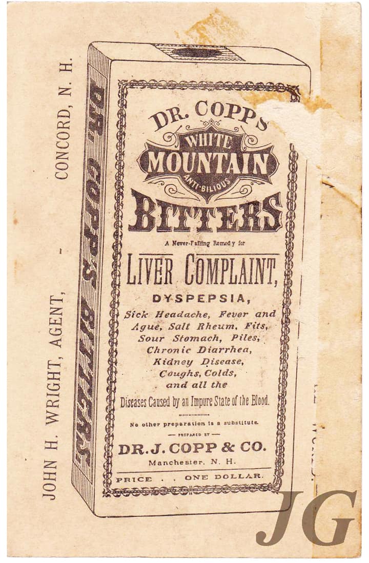
Trade cards
C 232 DR. COPP’S WHITE MOUNTAIN BITTERS, Numerous stock trade card sets exist with topical illustrations such as The Seven Wonders of the World, Dr. Copp’s road signs, Sepia tone cards of illustrations of children, Currier & Ives cards, Darkies , Beach, Nature, Roller Skating, Beach and Barn Yard. Most sets, on the reverse, have an illustrated box of Dr. Copp’s White Mountain Anti-Bilious Bitters or the Dr. Copp’s logo and product information, Dr. J. Copp & Co., Manchester N. H. Price .. One Dollar. Slight variations of box illustration and listings of General Agents.
Let’s take a moment to look at Joe’s cards in series he has established. He is actively searching for missing examples.
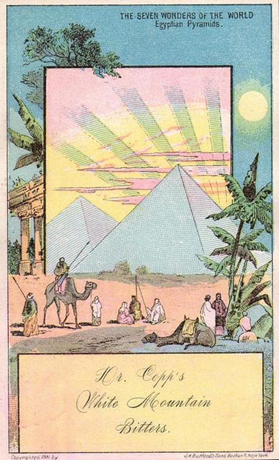
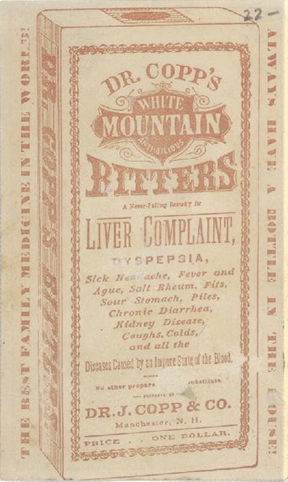
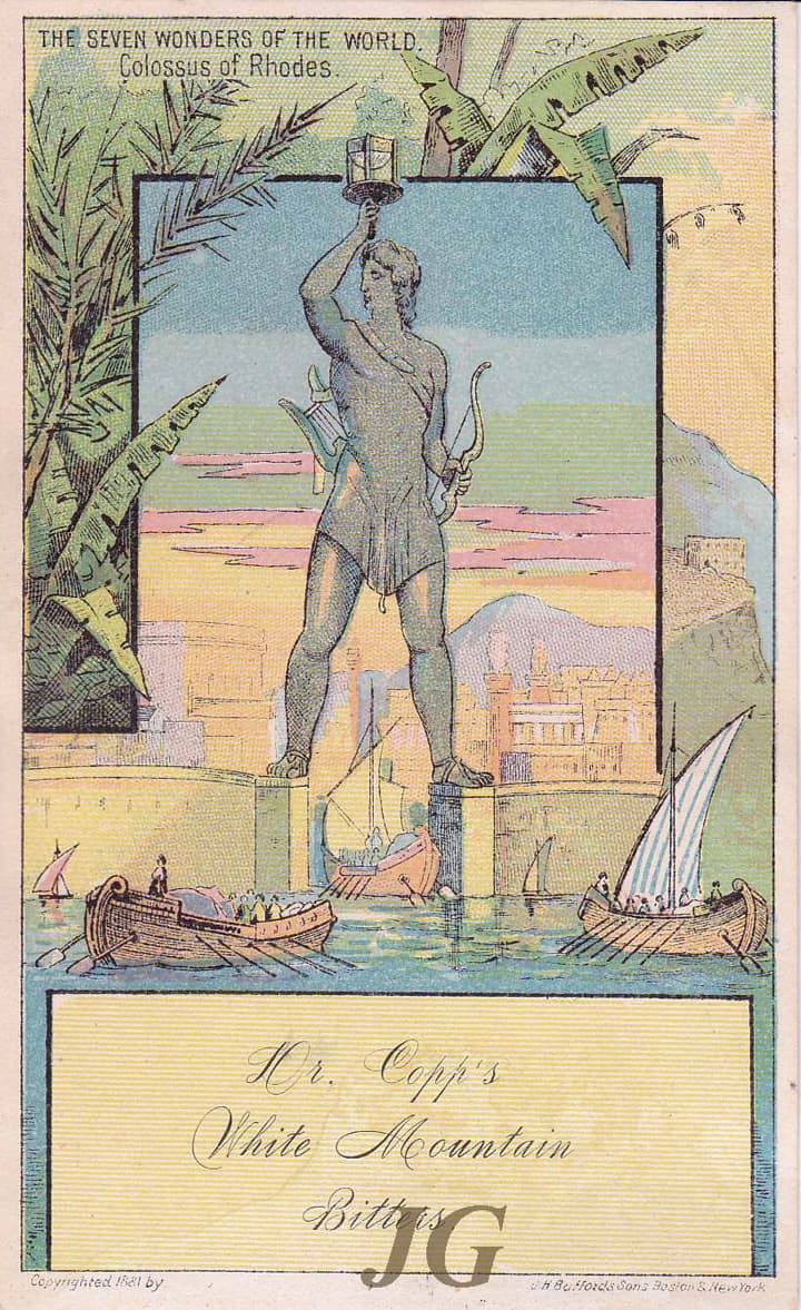
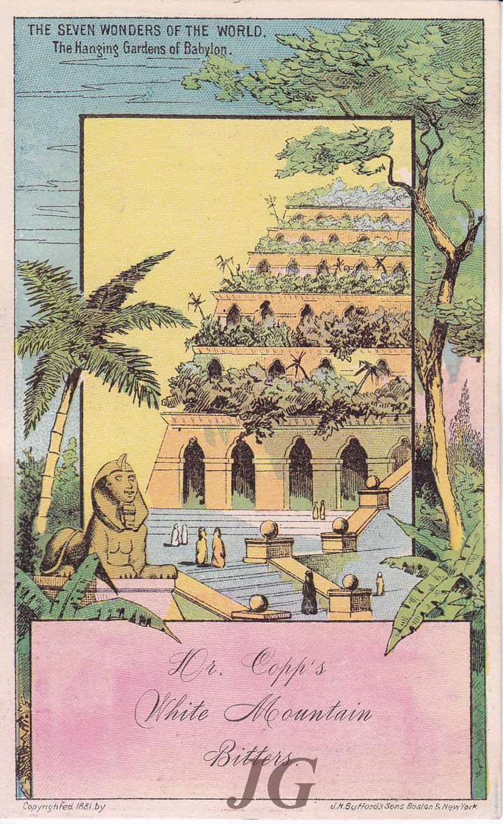
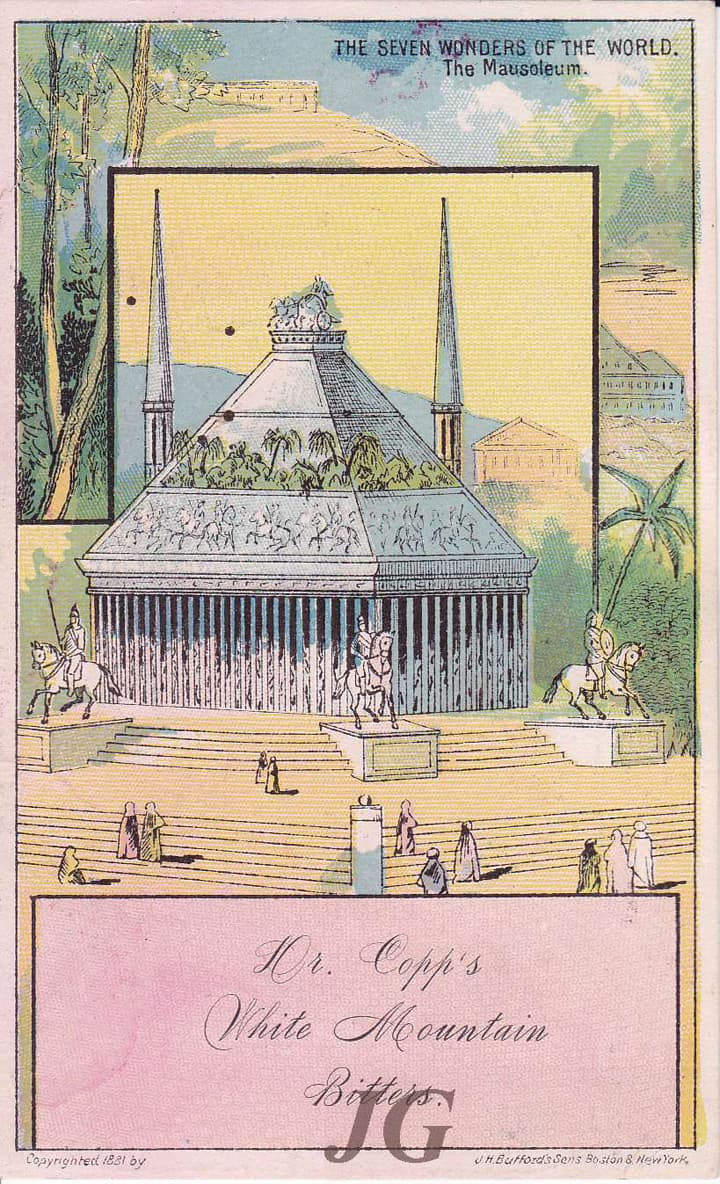
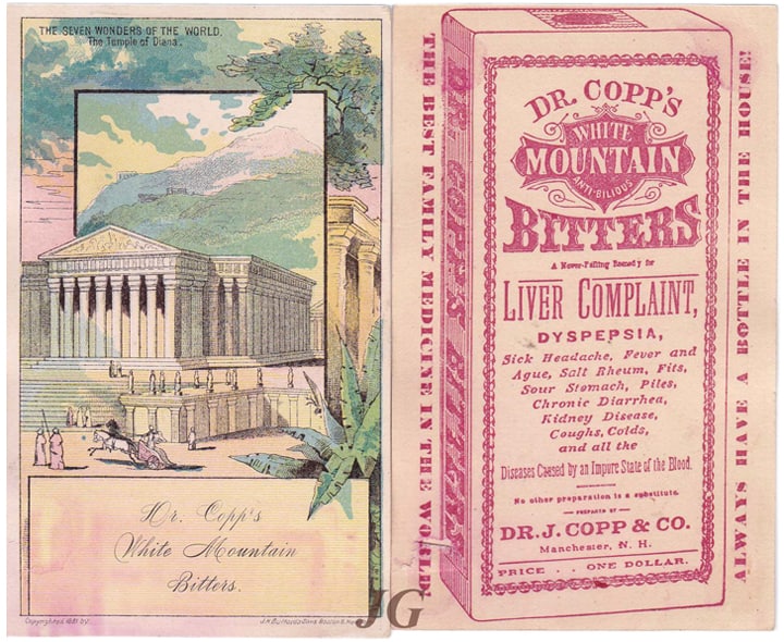
THE SEVEN WONDERS OF THE WORLD
Gorgeous pastel colored cards depicting the Alexandria Lighthouse, Statue of Jupiter, Egyptian Pyramids, Colossus of Rhodes, The Hanging Gardens of Babylon, Mausoleum of Halicarnassus and The Temple of Diana. Dr. Copp’s White Mountain Bitters in script on a common framed plain box on the bottom of each of the vertical cards. An illustrated box of Dr. Copp’s White Mountain Anti-Bilious Bitters depicting the Dr. Copp’s logo and product information occurs on the reverse. Copyrighted 1881 by J. H. Bufford’s Sons, Boston & New York.
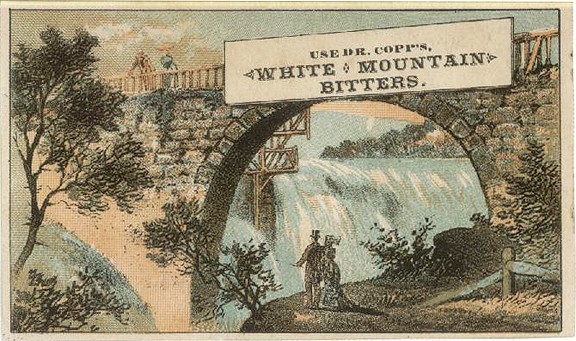
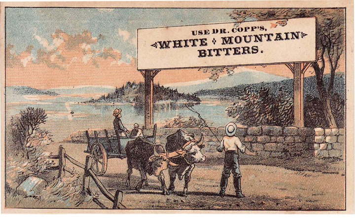
DR. COPP’S ROAD SIGNS
Typically horizontal cards of scenic landmarks with obtrusive signs saying “Use Dr. Copp’s White Mountain Bitters.” Many bitters manufacturers actually this form of guerilla advertising. An illustrated box of Dr. Copp’s White Mountain Anti-Bilious Bitters depicting the Dr. Copp’s logo and product information occurs on the reverse.


SEPIA TONE CARDS
Beautiful, soft illustrations of a young girl descending steps in her bed clothing holding the family cat and a toy house. A puppy waits for her. You wonder if she is going to trip. The second card shows a young lady sketching. Third card depicts a Scottish couple crossing a footbridge with Westie at foot. Cards surprinted in magenta ink with the Dr. Copp’s White Mountain Bitters logo. Gies & Co., New York & Buffalo printed on bottom card faces. A reversed-out illustrated box of Dr. Copp’s White Mountain Anti-Bilious Bitters depicting the Dr. Copp’s logo and product information occurs on the reverse in the same magenta ink.


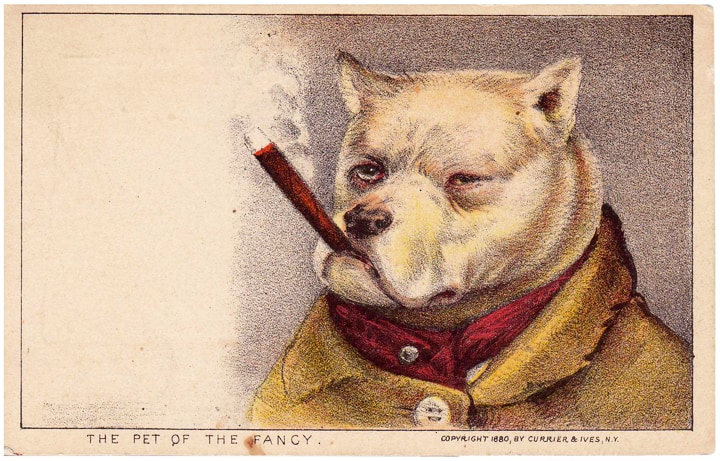
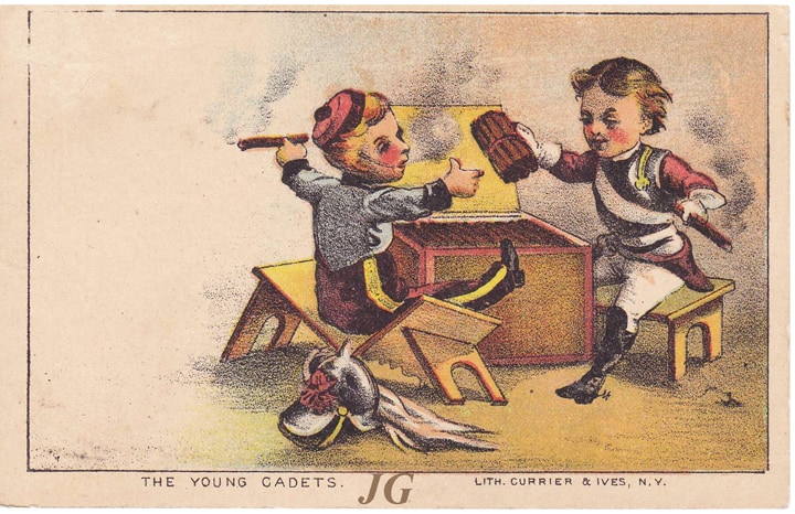
CURRIER & IVES CARDS
Cards reading THE PET OF THE FANCY and THE YOUNG CADETS. Lith. Currier & Ives, N.Y. Currier and Ives was a successful American printmaking firm based in New York City from 1835 to 1907 headed first by Nathaniel Currier, and later jointly with his partner James Merritt Ives. The prolific firm produced prints from paintings by fine artists as black and white lithographs that were hand colored. Lithographic prints could be reproduced quickly and purchased inexpensively, and the firm called itself “the Grand Central Depot for Cheap and Popular Prints” and advertised its lithographs as “colored engravings for the people”. The firm adopted the name “Currier and Ives” in 1857.
An illustrated box of Dr. Copp’s White Mountain Anti-Bilious Bitters depicting the Dr. Copp’s logo and product information occurs on the reverse with agent information.
BLACK
Politically stirring cards using black stereotype illustrations and controversial topics. The first card,”A Revival” depicting an incensed orator speaking to an emotional gathering. The second card is “A Cabin in the Good Old Time” and the third, “In the Land of Cotton.” Glorifying slavery. Copyrighted 1882 by J. H. Bufford’s Sons, Boston & New York.

BEACH #1
Three oddly proportioned young persons on a beach depicted on both cards. The barefoot girl seems to be serving fresh fish and shrimp to a well-dressed couple. Use Dr. Copp’s White Mountain Bitters surprinted or stamped on front of cards. The Dr. Copp’s logo and product information occurs on the reverse with druggist information.


ROLLER SKATING
Rather clumsy series depicting people falling while they are roller-skating. Cards have different titles such as “A Header”, “A Mash”, “A Base Hit”, “Got Em Foul”, OH! Don’t Let Me Fall” and “Short Stop.” Either Copyrighted 1883 by J. H. Bufford’s Sons or J. H. Bufford’s Sons printed on bottom right of card face. Use Dr. Copp’s White Mountain Bitters surprinted or stamped on front of card. The Dr. Copp’s logo and product information occurs on the reverse with agent information.


BEACH #2
A different style illustration than Beach #1. The dog is shaking off water on the first card as a fully dressed woman wades in the beach water. A lobster is helping a hapless sort fish from the shore in card 2. A gentleman craws in the water in front of two women. Dr. Copp’s White Mountain Bitters in script on the front of the third card. An illustrated box of Dr. Copp’s White Mountain Anti-Bilious Bitters depicting the Dr. Copp’s logo and product information occurs on the reverse.


Barnyard
This could be my favorite card because it is so well illustrated and colorful. Titled, “The Original Hen – Pecked”, it depicts a hen chasing a rooster and pecking his feathers. Men who take these bitters will certainly connect. Use Dr. Copp’s White Mountain Bitters surprinted or stamped on front of card. The Dr. Copp’s logo and wonderful typography explain all of the bitters merits are on the reverse.