
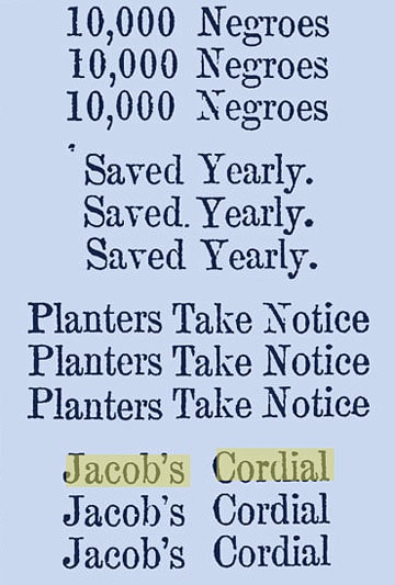
Quite a statement! Portion of a vertical advertisement in The Charleston Mercury – Sep 13, 1859
JACOB’S CORDIAL!
Dysentery and Diarrhea are of such universal prevalence that it behooves every one to be in possession of a remedy that will cure it at once. Jacob’s Cordial will do this, and we wish every family who has occasion for testing any preparation, would give this a trial, for we know this to be a valuable medicine, and if taken early, one dose will be sufficient for a cure.
For sale in New Orleans, wholesale and retail, by T. W. Wright & Co., No 21 Chartres Street, Between Canal and Custom House Streets
The Daily True Delta – Dec 2, 1863
 Searching through some old New Orleans and Charleston, South Carolina newspapers around 1859 – 1863, I was impressed with the typesetting and typography for Jacob’s Cordial. One advertisement (see below) was a single column and took up the entire page space. The use of capital letters and repetition was a great tool to catch your eye. Obviously with no color and few illustrations you needed a gimmick to sell your product and stand out from the crowd on the printed pages.
I can not find a picture of this bottle. Can someone help me out? Who was jacob and where was this cordial made?
Articles Sent Away to Virginia
To Hospital at Charlottesville, Virginia –
First shipment, five boxes.
Second shipment, seven boxes.
Third shipment, by crate, one bottle port wine, twenty-seven bottles blackberry wine, two bottles medicine, one of plum cordial, one of cherry cordial, two of damson plums, one package of cream tartar, one dozen powders.
First Box—One dozen Jacob’s cordial, one blackberry cordial, one bottle camplior, four pounds coffee, one package sage, one bag sugar, one bag rice, one box salt.
South Carolina Women in the Confederacy – Minutes of the Ladies’ Relief Association of Fairfield.

Jacob’s Cordial advertisement – The Daily True Delta (New Orleans) – Sep 17, 1859


I’ve also noticed some great typesetting/typography for advertisements in my research, other notables such as sideways ads and upside down advertisements, both of which certainly catch your eye when scanning these old newspapers.